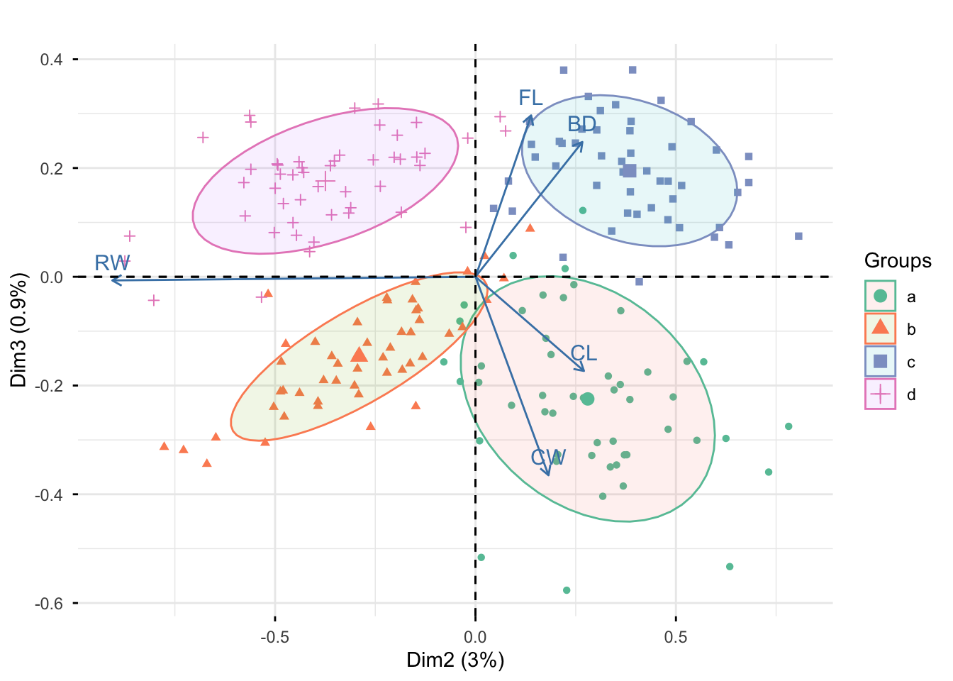
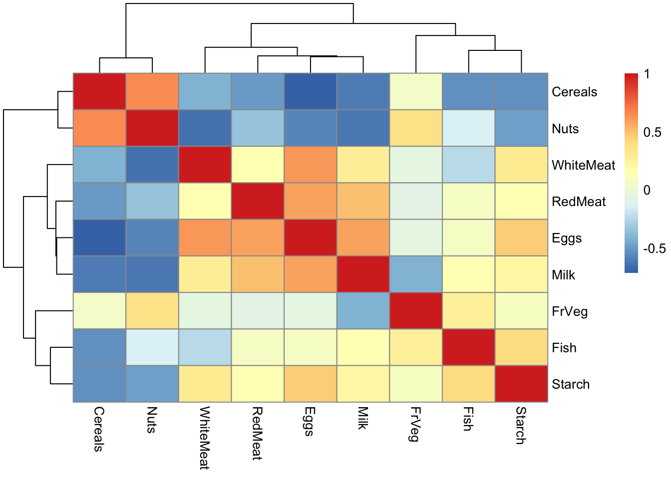
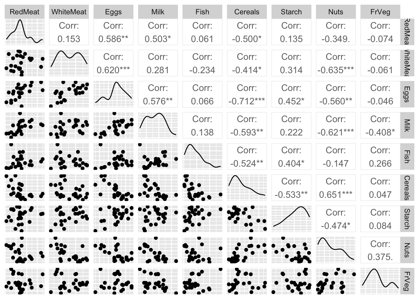
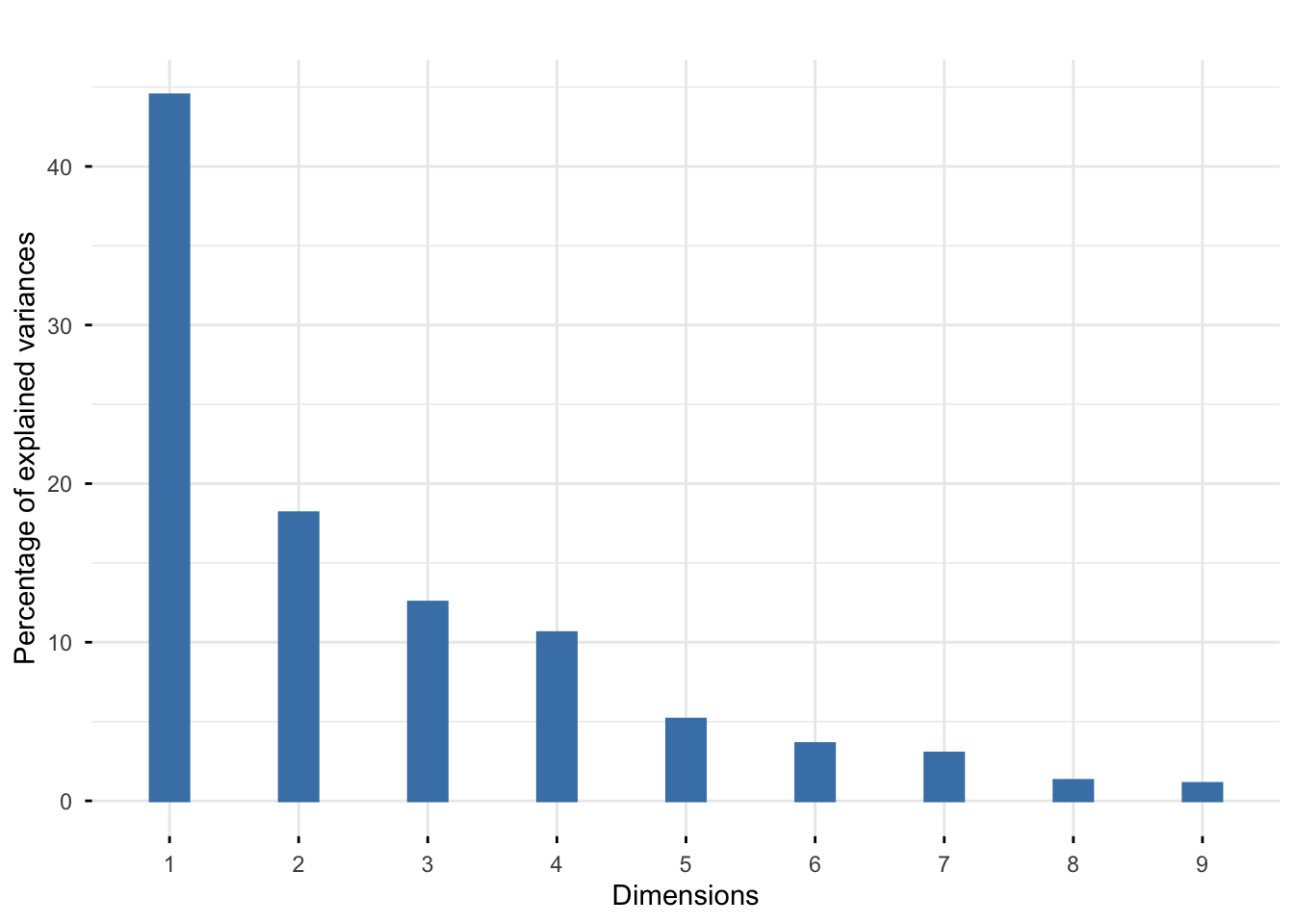
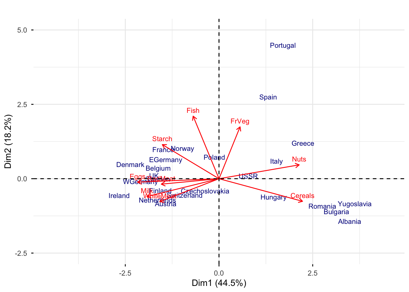
8  Principal Component Analysis

8.1 Lecture Slides

View slides in full screen

8.2 Lab

8.2.1 1. Crabs data

We consider a data that consists of information about 200 crabs.

The variables available in the dataset are:

  • FL: frontal lob length;
  • RW: rear width;
  • CL: carapace length;
  • CW: carapace width;
  • BD: body height;
  • TYPE: sex and color (a: blu males, b: blue females, c: orange males, d: orange females)

The goal is to study whether crabs of different “sex” and “color” also differ in their shapes?

Load the data and and glimpse at the data

library(dplyr)
library(ggplot2)
load("slides/data/crabs.rda")
glimpse(crabs)
Rows: 200
Columns: 6
$ FL   <dbl> 8.1, 8.8, 9.2, 9.6, 9.8, 10.8, 11.1, 11.6, 11.8, 11.8, 12.2, 12.3…
$ RW   <dbl> 6.7, 7.7, 7.8, 7.9, 8.0, 9.0, 9.9, 9.1, 9.6, 10.5, 10.8, 11.0, 10…
$ CL   <dbl> 16.1, 18.1, 19.0, 20.1, 20.3, 23.0, 23.8, 24.5, 24.2, 25.2, 27.3,…
$ CW   <dbl> 19.0, 20.8, 22.4, 23.1, 23.0, 26.5, 27.1, 28.4, 27.8, 29.3, 31.6,…
$ BD   <dbl> 7.0, 7.4, 7.7, 8.2, 8.2, 9.8, 9.8, 10.4, 9.7, 10.3, 10.9, 11.4, 1…
$ TYPE <fct> a, a, a, a, a, a, a, a, a, a, a, a, a, a, a, a, a, a, a, a, a, a,…

8.2.1.1 Data wrangling and exploration

Compute the matrix of all correlations between the measurements from the crabs data and display the matrix in a heatmap. What do you notice ?

cor(crabs[, names(crabs) != "TYPE"])
          FL        RW        CL        CW        BD
FL 1.0000000 0.9069876 0.9788418 0.9649558 0.9876272
RW 0.9069876 1.0000000 0.8927430 0.9004021 0.8892054
CL 0.9788418 0.8927430 1.0000000 0.9950225 0.9832038
CW 0.9649558 0.9004021 0.9950225 1.0000000 0.9678117
BD 0.9876272 0.8892054 0.9832038 0.9678117 1.0000000
library("pheatmap")
pheatmap(cor(crabs[, names(crabs) != "TYPE"]), cell.width = 10, cell.height = 10)

From the correlation matrix, we can see that the variables are highly correlated.

Produce all pairwise scatterplots for the crabs data (except TYPE). Use the package GGally.

library(GGally)
ggpairs(crabs[, -6], axisLabels = "none")

Exercise
  1. Guess the underlying or “true dimension” of the data?

Repeat the above step, this time, however, by highlighting the different crab types.

library(RColorBrewer)
my_colors <- brewer.pal(n = 4, name = "Set2")
ggpairs(
  crabs,
  columns = setdiff(names(crabs), "TYPE"),
  aes(color = TYPE),
  upper = list(continuous = wrap("cor", size = 4)),
  lower = list(continuous = wrap("points",  size = 0.8)),
  diag = list(continuous = wrap("box_no_facet"))
)+
  scale_color_manual(values = my_colors) +
  scale_fill_manual(values = my_colors)

From the plot, we can see that “color” and “sex” seem to influence the measurements, but it is not clear how.

8.2.1.2 Principal Component Analysis

Before performing Principal Component Analysis (PCA), we need to transform the data to some common scale because different variables are measured in different units. Therefore, they are not directly comparable in their original form. Here, we centering and scaling the data so that the new data has mean 0, and standard deviation is 1.

Compute the means and standard deviations of the crab data, then use the scale function to center and standardize the continuous variables.

apply(crabs[, -6], 2, sd)
      FL       RW       CL       CW       BD 
3.495325 2.573340 7.118983 7.871955 3.424772 
apply(crabs[, -6], 2, mean)
     FL      RW      CL      CW      BD 
15.5830 12.7385 32.1055 36.4145 14.0305 
scaledcrabs = scale(crabs[, -6])
apply(scaledcrabs, 2, mean)
           FL            RW            CL            CW            BD 
-6.076086e-17 -7.926711e-17  1.027292e-16  4.211171e-16  2.897856e-17 
apply(scaledcrabs, 2, sd)
FL RW CL CW BD 
 1  1  1  1  1 

Make a scatterplot of the scaled and centered crabs data and color the points by their types.

scaledcrabs <- data.frame(scaledcrabs, TYPE = crabs$TYPE) 
ggpairs(
  scaledcrabs,
  columns = setdiff(names(crabs), "TYPE"),
  aes(color = TYPE),
  upper = list(continuous = wrap("cor", size = 4)),
  lower = list(continuous = wrap("points", size = 0.8)),
  diag = list(continuous = wrap("box_no_facet"))
)+
  scale_color_manual(values = my_colors) +
  scale_fill_manual(values = my_colors)

We now can perform PCA on the crabs data using the function prcomp.

pca_crabs =  prcomp(scaledcrabs[,-6])
print(summary(pca_crabs))
Importance of components:
                          PC1     PC2     PC3     PC4     PC5
Standard deviation     2.1883 0.38947 0.21595 0.10552 0.04137
Proportion of Variance 0.9578 0.03034 0.00933 0.00223 0.00034
Cumulative Proportion  0.9578 0.98810 0.99743 0.99966 1.00000

These values help us to understand how useful each principal component is.

  1. Standard Deviation shown in PCA is the square root of the variance explained by each principal component. Therefore, higher standard deviation means component captures more variation in the data, so it is considered more important. PC1 captures the largest variation, so it is the most important component.

  2. Proportion of Variance shows the percentage of total dataset variance explained by each principal component. In this case, \(PC1 =0.957767\) it means that the first component explain 95.78% the total variance.

  3. Cumulative Proportion shows the total variance explained up to that component. Here, \(PC1 = 0.957767, PC2 = 0.03033704\), then Cumulative after \(PC2 = 0.98810400 (98.81\%)\) This helps decide how many components to keep.

We also can look at how important each principal component is by looking at screeplot, which will help us choose a rank for representing the data.

library("factoextra")
fviz_eig(pca_crabs, geom = "bar", bar_width = 0.3) + ggtitle("")

The screeplot shows a clear drop in the percentages after the first one. This indicates that a good approximation will be obtained at rank 1.

Now look at Component loadings that tell us how strongly each original variable contributes to each principal component.

print(pca_crabs$rotation)
         PC1        PC2         PC3          PC4         PC5
FL 0.4520437  0.1375813  0.53076841  0.696923372  0.09649156
RW 0.4280774 -0.8981307 -0.01197915 -0.083703203 -0.05441759
CL 0.4531910  0.2682381 -0.30968155 -0.001444633 -0.79168267
CW 0.4511127  0.1805959 -0.65256956  0.089187816  0.57452672
BD 0.4511336  0.2643219  0.44316103 -0.706636423  0.17574331

The first principal component is the linear combination of the original variables

\[Y_1 = 0.45 FL + 0.43 RW + 0.45 CL + 0.45CW + 0.45 BD\]

Exercise

What do you notice about the weight of variables ?

When all variables are positively correlated, as in our case, the first principal component always turns out to be an average of the original variables which explains a lot in terms of variability. Yet, it is not necessarily useful to answer our research question, as it almost always “captures” a well known, if not obvious, characteristic of the phenomenon under study (in our case, it can be seen as a measure of the “total dimension” of the crab). Therefore, we are often more interested in later components (PC2, PC3) because they may reveal differences between variables.

Now we look at the relationships between the variables, both old and new by drawing the correlation circle.

fviz_pca_var(pca_crabs, col.var = "blue", repel = TRUE) + 
  ggtitle("")+
  xlim(c(-1.2, 1.2)) +
  ylim(c(-0.5, 0.5))

Exercise

What does the correlation circle tell you ?

The correlation circle tells you:

  1. Contribution of variables to principal components: The lengths of the arrows indicate how strongly each variable contributes to the principal components (Long arrows means variable contributes strongly to the components; Short arrows means variable contributes weakly).

  2. Correlation between variables: Their correlations with each other are given by the angles between the vectors (Small angle means strong positive correlation, \(180^0\) angle means strong negative correlation, \(90^0\) angle means no correlation).

  3. Relation of variables with components Their correlations with the new principal components are given by the angles between the vectors and between the axes (Arrow pointing mainly horizontal means strongly related to PC1).

We can plot both the samples and the variables on a biplots.

fviz_pca_biplot(pca_crabs, label = "var",
                habillage = scaledcrabs$TYPE)+
  scale_color_manual(values = my_colors)

  ggtitle("")
<ggplot2::labels> List of 1
 $ title: chr ""
Exercise
  1. Do the males or female crabs tend to have larger rear width?
  2. What do the arrows tell us about the correlations? What do you notice about the angles among arrows?

Produce all pairwise scatterplots of the rotated data (i.e., coordinate of an observation in the new PC coordinate system)

data_pca <- cbind(pca_crabs$x, tibble(TYPE = scaledcrabs$TYPE)) 
ggpairs(data_pca ,
  columns = setdiff(names(data_pca), "TYPE"),
  aes(color = TYPE),
  upper = list(continuous = wrap("cor", size = 4)),
  lower = list(continuous = wrap("points", size = 0.8)),
  diag = list(continuous = wrap("box_no_facet"))
)+
  scale_color_manual(values = my_colors) +
  scale_fill_manual(values = my_colors)

Exercise
  1. Your comments? Is there something “interesting” going on with the boxplot?

A zoom out on the scatterplot of the second and third principal component

ggplot(data_pca, aes(x = PC2, y = PC3)) +
  geom_point(aes(color = TYPE), size = 3)+
  scale_color_manual(values = my_colors)

Now we look at biplot of data on the second and third priciple component

fviz_pca_biplot(pca_crabs, axes = c(2, 3), 
                label = "var", 
                habillage = scaledcrabs$TYPE,
                addEllipses = TRUE,
                ellipse.level = 0.7) +
  scale_color_manual(values = my_colors)+
  ggtitle("")

Exercise
  1. Your comments?

8.2.2 2. How was European food in 1973?

The dataset provides protein consumption of various countries divided by the sources of the same. The data were collected in 1973 which explains why some countries no longer exist! The names of the variables should be self-explanatory. Starch represents largely potatoes. Nuts also includes oils and legumes (and, indeed, is composed almost exclusively of these, not of “nuts”).

The goal is to study how was European food in 1973?

Load the data and and glimpse at the data

load("slides/data/protein.rda")
glimpse(protein)
Rows: 25
Columns: 9
$ RedMeat   <dbl> 10.1, 8.9, 13.5, 7.8, 9.7, 10.6, 8.4, 9.5, 18.0, 10.2, 5.3, …
$ WhiteMeat <dbl> 1.4, 14.0, 9.3, 6.0, 11.4, 10.8, 11.6, 4.9, 9.9, 3.0, 12.4, …
$ Eggs      <dbl> 0.5, 4.3, 4.1, 1.6, 2.8, 3.7, 3.7, 2.7, 3.3, 2.8, 2.9, 4.7, …
$ Milk      <dbl> 8.9, 19.9, 17.5, 8.3, 12.5, 25.0, 11.1, 33.7, 19.5, 17.6, 9.…
$ Fish      <dbl> 0.2, 2.1, 4.5, 1.2, 2.0, 9.9, 5.4, 5.8, 5.7, 5.9, 0.3, 2.2, …
$ Cereals   <dbl> 42.3, 28.0, 26.6, 56.7, 34.3, 21.9, 24.6, 26.3, 28.1, 41.7, …
$ Starch    <dbl> 0.6, 3.6, 5.7, 1.1, 5.0, 4.8, 6.5, 5.1, 4.8, 2.2, 4.0, 6.2, …
$ Nuts      <dbl> 5.5, 1.3, 2.1, 3.7, 1.1, 0.7, 0.8, 1.0, 2.4, 7.8, 5.4, 1.6, …
$ FrVeg     <dbl> 1.7, 4.3, 4.0, 4.2, 4.0, 2.4, 3.6, 1.4, 6.5, 6.5, 4.2, 2.9, …

8.2.2.1 Data wrangling and exploration

Display the matrix of all correlations between the measurements in a heatmap. What do you notice ?

pheatmap(cor(protein), cell.width = 10, cell.height = 10)

Produce all pairwise scatterplots for the protein data

ggpairs(protein, axisLabels = "none")

8.2.2.2 Principle component analysis

Perform PCA on the protein data

pca_protein =  prcomp(protein, scale. = TRUE)
print(summary(pca_protein))
Importance of components:
                          PC1    PC2    PC3    PC4     PC5     PC6     PC7
Standard deviation     2.0016 1.2787 1.0620 0.9771 0.68106 0.57020 0.52116
Proportion of Variance 0.4452 0.1817 0.1253 0.1061 0.05154 0.03613 0.03018
Cumulative Proportion  0.4452 0.6268 0.7521 0.8582 0.90976 0.94589 0.97607
                           PC8     PC9
Standard deviation     0.34102 0.31482
Proportion of Variance 0.01292 0.01101
Cumulative Proportion  0.98899 1.00000

We also can look at how important each principal component is by looking at screeplot.

fviz_eig(pca_protein, geom = "bar", bar_width = 0.3) + ggtitle("")

Exercise

Your comments ? How many principle components that we should choose?

We also can look on the biplot

fviz_pca_biplot(pca_protein, 
                geom.ind = "text",
                label = "all", 
                col.var = "red",
                col.ind = "darkblue",
                labelsize = 3)+
  xlim(c(-4.5, 4.5)) +
  ylim(c(-2.5, 5))+
  ggtitle("")

Exercise
  1. With respect to the other countries, which was the most important source of protein in Romania in 1973? Which countries had similar eating habits?

  2. How does the diet of the Iberian Peninsula (Spain and Portugal) differ from the rest of Europe?

  3. Which are the countries where many proteins are “recovered” by eating meat (white or red) or other products derived from “terrestrial” animals (i.e., eggs and milk)?

  4. Is fish consumption more prominent in Norway or Ireland?

8.2.3 3. Hiiragi data 1

The data consist of 101 columns correspond to the samples (each of these is a single cell), and 45101 rows correspond to the genes probed by the array, an Affymetrix mouse4302 array. The data were normalized using the RMA method.

The data is included in the Hiiragi2013 package. To import the data, we first need to install the Hiiragi2013 package by BiocManager::install("Hiiragi2013")

library(Hiiragi2013)
data("x")
dim(Biobase::exprs(x))
[1] 45101   101

In this example, we select only the wildtype (WT) samples and the top 100 features with the highest overall variance.

xwt <- x[, x$genotype == "WT"]
ind_sel <- order(rowVars(exprs(xwt)), decreasing = TRUE)[1:100]
xwt <- xwt[ind_sel, ]
tab <- table(xwt$sampleGroup)
tab

     E3.25 E3.5 (EPI)  E3.5 (PE) E4.5 (EPI)  E4.5 (PE) 
        36         11         11          4          4 

We see that the groups have very different sizes. To account for this, we reweigh each sample by the inverse of its group size. The weighted PCA can be performed by usng the function dudi.pca in the ade4 package.

library(ade4)
xwt$weight <- 1 / as.numeric(tab[xwt$sampleGroup])
pca_Hiiragi <- dudi.pca(
  as.data.frame(t(exprs(xwt))),
  row.w = xwt$weight,
  center = TRUE,
  scale = TRUE,
  nf = 2,
  scannf = FALSE
)
fviz_eig(pca_Hiiragi) + ggtitle("")

We can visualize groups on the space of the first and second compoment.

fviz_pca_ind(pca_Hiiragi, geom = "point", col.ind = xwt$sampleGroup) +
  ggtitle("") 

8.3 Homework

Exercise 1. Many PCA functions have been created by different teams who worked in different areas at different times. This can lead to confusion, especially because they have different naming conventions. Compare these three function princomp, prcomp, and dudi.pca. What happens if you perform PCA on the original data?

Exercise 2. Calibration of a near-infrared spectrophometer (NIR)

Load the data gasoline.rda.

The data give the octanes of 60 samples of a liquid similar to gasoline and their spectra in the near infrared. The spectra are represented by the variables called NIR.xxx nm where xxx indicates the frequency. There is a total of 401 frequencies, ranging from 900 to 1700~nm.

  1. We could fit a linear regression model of octane as the response with all variables NIR.xxx nm?

  2. Extract from the NIR spectra a small number of principal components and use these as covariates in the linear regression model.

-  How many principle components that we should keep?
-  What does the result of liner model tell you?
-  How to predict the octanes of a new sample?

8.4 Further reading

  • S. Holmes and W. Huber. Modern Statistics for Modern Biology. Chapter 7.

References


  1. The example about Hiiragi data comes from S. Holmes and W. Huber. Modern Statistics for Modern Biology. Chapter 7.↩︎