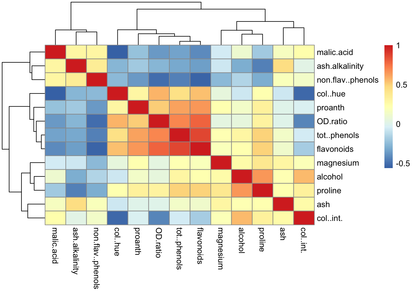
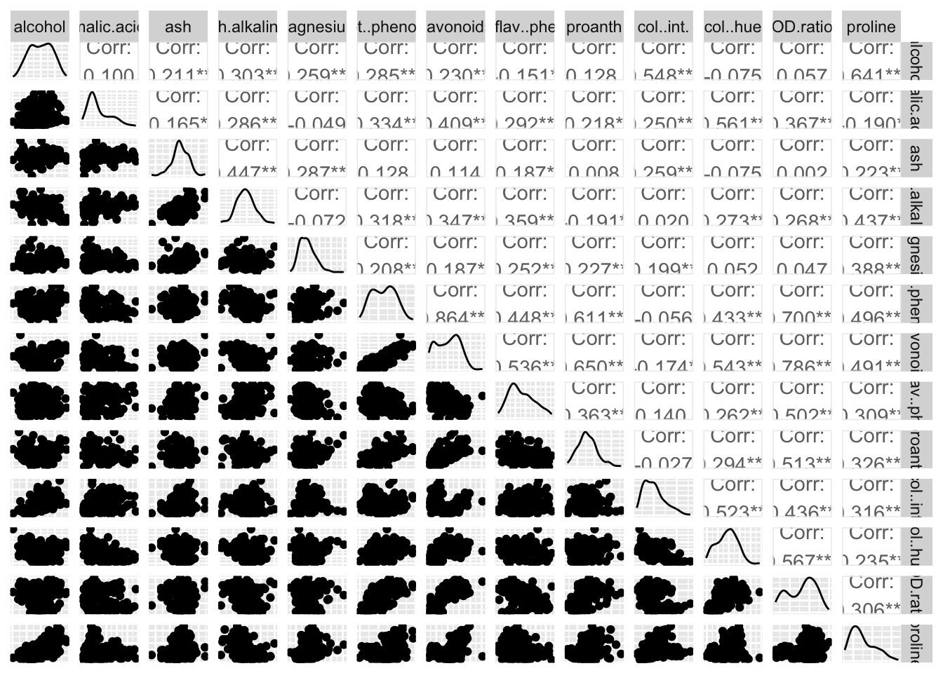
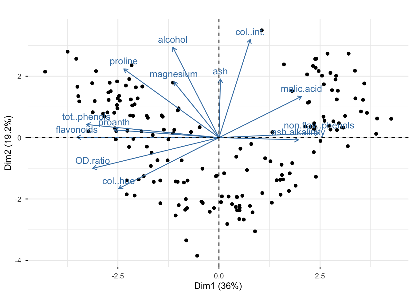
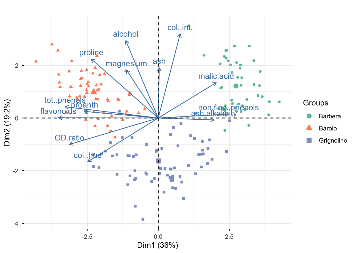
9  Clustering

9.1 Lecture Slides

View slides in full screen

9.2 Lab

9.2.1 Are red wines of the Langhe region different?

The data consits of 177 samples of red wine produced in the municipalities of (and bordering) Alba, Morra and Barolo. In fact, the data is complete because the variable vintages identifies the grape variety. Let us suppose that we don’t know the variety. Our goal is to study which groups get “detected” by the clustering algorithms.

The 13 organoleptic characteristics available in the dataset are:

  • alcohol percentage of alcohol in the wine
  • malic.acid concentration of malic acid
  • ash mineral content remaining after burning the sample
  • ash.alkalinity alkalinity level of the ash
  • magnesium magnesium content
  • total..phenols amount of phenolic compounds
  • flavanoids a specific class of phenolic compounds affecting taste and color
  • non.flav..phenols phenols that are not flavonoids
  • proanth compounds contributing to bitterness and astringency
  • color..int strength of wine color
  • col..hue shade of the wine color
  • OD.ratio ratio measuring phenolic concentration using spectrophotometry
  • proline amino acid concentration related to grape ripeness

Load the data and and glimpse at the data

library(dplyr)
library(ggplot2)
library(factoextra)
library(ade4)
library(pheatmap)
library(RColorBrewer)
library(GGally)

load("slides/data/vini.rda")
glimpse(vini)
Rows: 177
Columns: 14
$ vintages          <fct> Barolo, Barolo, Barolo, Barolo, Barolo, Barolo, Baro…
$ alcohol           <dbl> 13.20, 13.16, 14.37, 13.24, 14.20, 14.39, 14.06, 14.…
$ malic.acid        <dbl> 1.78, 2.36, 1.95, 2.59, 1.76, 1.87, 2.15, 1.64, 1.35…
$ ash               <dbl> 2.14, 2.67, 2.50, 2.87, 2.45, 2.45, 2.61, 2.17, 2.27…
$ ash.alkalinity    <dbl> 11.2, 18.6, 16.8, 21.0, 15.2, 14.6, 17.6, 14.0, 16.0…
$ magnesium         <dbl> 100, 101, 113, 118, 112, 96, 121, 97, 98, 105, 95, 8…
$ tot..phenols      <dbl> 2.65, 2.80, 3.85, 2.80, 3.27, 2.50, 2.60, 2.80, 2.98…
$ flavonoids        <dbl> 2.76, 3.24, 3.49, 2.69, 3.39, 2.52, 2.51, 2.98, 3.15…
$ non.flav..phenols <dbl> 0.26, 0.30, 0.24, 0.39, 0.34, 0.30, 0.31, 0.29, 0.22…
$ proanth           <dbl> 1.28, 2.81, 2.18, 1.82, 1.97, 1.98, 1.25, 1.98, 1.85…
$ col..int.         <dbl> 4.38, 5.68, 7.80, 4.32, 6.75, 5.25, 5.05, 5.20, 7.22…
$ col..hue          <dbl> 1.05, 1.03, 0.86, 1.04, 1.05, 1.02, 1.06, 1.08, 1.01…
$ OD.ratio          <dbl> 3.40, 3.17, 3.45, 2.93, 2.85, 3.58, 3.58, 2.85, 3.55…
$ proline           <dbl> 1050, 1185, 1480, 735, 1450, 1290, 1295, 1045, 1045,…

9.2.1.1 Data wrangling and exploration

Display the matrix of all correlations between the measurements in a heatmap. What do you notice ?

pheatmap(cor(vini[,-1]), cell.width = 10, cell.height = 10)

Produce all pairwise scatterplots for the vini data (except vintages)

ggpairs(vini[, -1], axisLabels = "none")

Exercise

Does the plot tell you anything?

Try to plot the data on the PC component space

pca_vini =  prcomp(vini[,-1], scale. = TRUE)
print(summary(pca_vini))
Importance of components:
                          PC1    PC2    PC3     PC4     PC5    PC6     PC7
Standard deviation     2.1628 1.5816 1.2055 0.96148 0.92830 0.8030 0.74295
Proportion of Variance 0.3598 0.1924 0.1118 0.07111 0.06629 0.0496 0.04246
Cumulative Proportion  0.3598 0.5522 0.6640 0.73515 0.80144 0.8510 0.89350
                           PC8     PC9    PC10    PC11    PC12   PC13
Standard deviation     0.59223 0.53775 0.49680 0.47481 0.41034 0.3224
Proportion of Variance 0.02698 0.02224 0.01899 0.01734 0.01295 0.0080
Cumulative Proportion  0.92048 0.94272 0.96171 0.97905 0.99200 1.0000
fviz_pca_biplot(pca_vini, label = "var") +
  ggtitle("")

Exercise

What do you notice from the biplot? How many groups should we choose?

Now you can check your answer with the true grape variety

my_colors <- brewer.pal(n = 3, name = "Set2")
fviz_pca_biplot(pca_vini, 
                label = "var", 
                habillage = vini$vintages) +
  scale_color_manual(values = my_colors)+
  ggtitle("")

9.2.1.2 Clustering

To avoid the final outcome depends on the measurement scales of the data, distances should be calculated on “standardized variables”.

scaledvini <- scale(vini[,-1])

Compute the Euclidean distance

dist_E <- dist(scaledvini)
9.2.1.2.1 Hierarchical clustering

Perform hierarchical clustering on the scaled data using Single linkage, Complete linkage, and Ward method. What do you notice?

hclust(dist_E, method = "single") |> plot(main = "Single linkage", cex=0.5)

hclust(dist_E, method = "complete") |> plot(main = "Complete linkage", cex=0.5)

hc_W <- hclust(dist_E, method = "ward.D2") 
plot(hc_W ,main = "Ward method", cex=0.5)

Exercise
  1. Which method should we choose?
  2. How many groups should we choose?

Decision rule choose the method that:

  • Shows largest vertical gaps before merging
  • Produces compact, balanced clusters
  • Has a clear number of clusters
  • Matches your real-world understanding

From the dendrogram, we can see the Ward method has the large jump before clusters merge and a clear number of cluster. Moreover, the data is complete, so we can check if the result of the hierarchical clustering discover the true cluster, i.e., the variable vintages. We add colors by using the mypclust function from the rafalib package.

library(rafalib)
vintages <- as.character(vini$vintages)
myplclust(hc_W, labels=vintages, lab.col=as.fumeric(vintages), cex=0.5)

It does seem that hierarchical clustering using the Ward method has discovered the variety.

Hierarchical clustering does not directly define specific clusters. Instead, the dendrogram shows the distance between groups: the height at which two branches split indicates how dissimilar those groups are. To obtain clusters, we need to cut the dendrogram at a chosen distance threshold, and all samples connected below that level are grouped into the same cluster. For example, if we cut the dendrogram at 27 we have three clusters; and if we cut the dendrogram at 12 we, have five clusters

myplclust(hc_W, labels=vintages, lab.col=as.fumeric(vintages), cex=0.5)
abline(h=27, col="red")
abline(h=12, col="orange")

In this example, the dendrogram clearly suggest three clusters because there is a clear separation before and after clusters merge. We also can examine how the clusters overlap with the actual vintages

hclusters <- cutree(hc_W, h=27)
table(true=vintages, cluster=hclusters)
            cluster
true          1  2  3
  Barbera     0  0 48
  Barolo     58  0  0
  Grignolino  5 58  8

We can also ask to cut the dendrogram in order to have a specific number of clusters by using the cutree function.

hclusters <- cutree(hc_W, k=3)
table(hclusters )
hclusters
 1  2  3 
63 58 56 
Exercise

Does this result match the actual vintages?

table(hclusters,vini$vintages) |> fisher.test()

    Fisher's Exact Test for Count Data

data:  table(hclusters, vini$vintages)
p-value < 2.2e-16
alternative hypothesis: two.sided

Calculate the Adjusted Rand Index (ARI)

library(mclust)
adjustedRandIndex(vini$vintages, hclusters)
[1] 0.7882419
Exercise

What the Adjusted Rand Index tell you?

If we do not have the true clusters we also can evaluate clustering result by calculating the silhouette width

library(cluster)
sil <- silhouette(hclusters , dist_E)
plot(sil, col = my_colors, border = NA)

Exercise

What the silhouette width tell you?

fviz_pca_biplot(pca_vini, 
                label = "var", 
                habillage = hclusters) +
  scale_color_manual(values = my_colors)+
  ggtitle("")

Exercise

How do these groups differ from each other?

9.2.1.2.2 K-means

Perform the k-means algorithm

set.seed(123)
km <- kmeans(dist_E, centers = 3, nstart = 10)

Calculate the Adjusted Rand Index and the silhouette width. Do they tell you the same story as Hierarchical clustering?

adjustedRandIndex(vini$vintages, km$cluster)
[1] 0.7679186
table(vini$vintages, km$cluster) |> fisher.test()

    Fisher's Exact Test for Count Data

data:  table(vini$vintages, km$cluster)
p-value < 2.2e-16
alternative hypothesis: two.sided
adjustedRandIndex(hclusters, km$cluster)
[1] 0.7648521
table(hclusters, km$cluster) |> fisher.test()

    Fisher's Exact Test for Count Data

data:  table(hclusters, km$cluster)
p-value < 2.2e-16
alternative hypothesis: two.sided
sil <- silhouette(km$cluster , dist_E)
plot(sil, col = my_colors, border = NA)

9.2.2 2. RNA gene expression 1

The data represent RNA expression measurements for 22,215 genes from 189 samples. Each sample is labeled with a tissue of origin.

Tissue Description
kidney Renal tissue, involved in filtering blood and urine production
hippocampus Brain region important for memory formation
cerebellum Brain region controlling coordination and balance
colon Part of the large intestine
liver Metabolic organ; detoxification, protein synthesis, bile production
endometrium Lining of the uterus
placenta Fetal-maternal organ during pregnancy

The data is in the tissuesGeneExpression package available on Github. To install we use comment

library(devtools)
install_github("genomicsclass/tissuesGeneExpression")

Load the data and glimse at the data

library(tissuesGeneExpression)
data(tissuesGeneExpression)
dim(e)
[1] 22215   189
table(tissue)
tissue
 cerebellum       colon endometrium hippocampus      kidney       liver 
         38          34          15          31          39          26 
   placenta 
          6 

Plot the heatmap of the 50 most variable genes, i.e., 50 genes with most variance over all samples using the heatmap.2 function from gplots package.

# select the top 50 most variable genes
library(genefilter)
rv <- rowVars(e)
idx <- order(rv,decreasing = TRUE)
exp_50 <- e[idx[1:50],]
# generate color for heatmap
hmcol <- colorRampPalette(brewer.pal(9, "GnBu"))(100)
library(gplots)
heatmap.2(exp_50, labCol=tissue,
          trace="none",
          ColSideColors=as.character(as.fumeric(tissue)+1),
          col=hmcol)

We did not use tissue information to create this heatmap, but just with 50 most variable genes, we have a good separation across tissues.

Calculate the range of the mean and variance of the data

range(apply(e,1,mean))
[1]  4.328881 14.036989
range(apply(e,1,sd))
[1] 0.05987416 3.30351280
Exercise

What do you notice?

9.2.2.1 Clustering

Compute the Euclidean distance

dist_E <- dist(t(e))
9.2.2.1.1 Hierarchical clustering

Perform hierarchical clustering using Single linkage, Complete linkage, and Ward method. What do you notice?

hclust(dist_E, method = "single") |> plot(main = "Single linkage", cex=0.5)

hclust(dist_E, method = "complete") |> plot(main = "Complete linkage", cex=0.5)

hc_W <- hclust(dist_E, method = "ward.D2") 
plot(hc_W ,main = "Ward method", cex=0.5)

Exercise
  1. Which method should we choose?
  2. How many groups should we choose?
myplclust(hc_W, labels=tissue, lab.col=as.fumeric(tissue), cex=0.5)

It does seem that hierarchical clustering using the Ward method has discovered the tissue.

Now, let cut the dendrogram at a certain height we wish to cut. We use 350 as an example:

myplclust(hc_W, labels=tissue, lab.col=as.fumeric(tissue), cex=0.5)
abline(h=350, col="red")

hclusters <- cutree(hc_W, h=350)
table(true=tissue, cluster=hclusters)
             cluster
true           1  2  3  4  5  6  7  8
  cerebellum   0  5 31  0  0  2  0  0
  colon        0  0  0 34  0  0  0  0
  endometrium  0  0  0  0  0  0 15  0
  hippocampus  0 31  0  0  0  0  0  0
  kidney      37  0  0  0  0  2  0  0
  liver        0  0  0  0 24  2  0  0
  placenta     0  0  0  0  0  0  0  6
Exercise

Does this result match the actual tissue?

Most tissues are clearly associated with a single cluster; however, in some cases, a tissue is split across two clusters. This is typically a consequence of overestimating the number of clusters. Selecting the right number of clusters remains a difficult and actively studied problem.

Calculate the Adjusted Rand Index (ARI)

adjustedRandIndex(tissue, hclusters)
[1] 0.8913948
Exercise

What the Adjusted Rand Index tell you?

Evaluate clustering result by calculating the silhouette width

my_colors <- brewer.pal(n = 8, name = "Set2")
sil <- silhouette(hclusters , dist_E)
plot(sil, col = my_colors, border = NA)

Exercise

What the silhouette width tell you?

9.2.2.1.2 K-means

Perform k-means algorithm

set.seed(123)
km <- kmeans(dist_E, centers = 7, nstart = 10)

Calculate the Adjusted Rand Index. Do they tell you the same story as Hierarchical clustering?

adjustedRandIndex(tissue, km$cluster)
[1] 0.8747183
adjustedRandIndex(hclusters, km$cluster)
[1] 0.9674547
9.2.2.1.3 Repeat everything on the subdata with the 50 most variable genes. What do you notice? Do these results agree with the results that you performed on the full data?
dist_E50 <- dist(t(exp_50))

# Hierarchical clustering
hc_W50 <- hclust(dist_E50, method = "ward.D2") 
myplclust(hc_W50, labels=tissue, lab.col=as.fumeric(tissue), cex=0.5)

hclusters50 <- cutree(hc_W50, k=8)
table(true=tissue, cluster=hclusters50)
             cluster
true           1  2  3  4  5  6  7  8
  cerebellum   0  0  0 33  0  0  0  5
  colon        0  0  0  0 29  5  0  0
  endometrium  0  0  0  0  0 15  0  0
  hippocampus  0  0 31  0  0  0  0  0
  kidney      24 15  0  0  0  0  0  0
  liver        0  0  0  0  0  0 26  0
  placenta     0  0  0  0  0  6  0  0
adjustedRandIndex(tissue, hclusters50)
[1] 0.8100697
adjustedRandIndex(hclusters, hclusters50)
[1] 0.7759082
pca_exp <- prcomp(t(exp_50), scale. = TRUE)
fviz_pca_ind(pca_exp, geom = "point", habillage = tissue) 

ggtitle("")
<ggplot2::labels> List of 1
 $ title: chr ""

9.3 Homework

Exercise 1. Repeat all the analysis that we did for Example 2 on the scale data. What do you notice? Do the new result agree with the result from Example 2 ?

Exercise 2. The fiumi.rda dataset includes measurements of chemical concentrations for 37 rivers or creeks of a particular geographical area. The variables available are:

  • NO3: nitrate \(NO_{3^-}\);
  • SO4: sulfate \(SO_{4}^{2-}\);
  • CL: chloride \(Cl^-\);
  • CA: calcium \(Ca^{2+}\);
  1. Check if the data is already standardized.

  2. Repeat the previous analysis (we did in Example 1) by using both, hierarchical clustering and K-Means. How many groups are there? Do hierarchical clustering and K-Means agree? What are the differences among the groups? Could the difference among the detected groups be due to the different sources of pollution in the catchment area of the rivers?

9.4 Further reading

  • S. Holmes and W. Huber. Modern Statistics for Modern Biology. Chapter 5.

References


  1. The example 2 about gene expression comes from from Data Analysis for the Life Sciences.↩︎