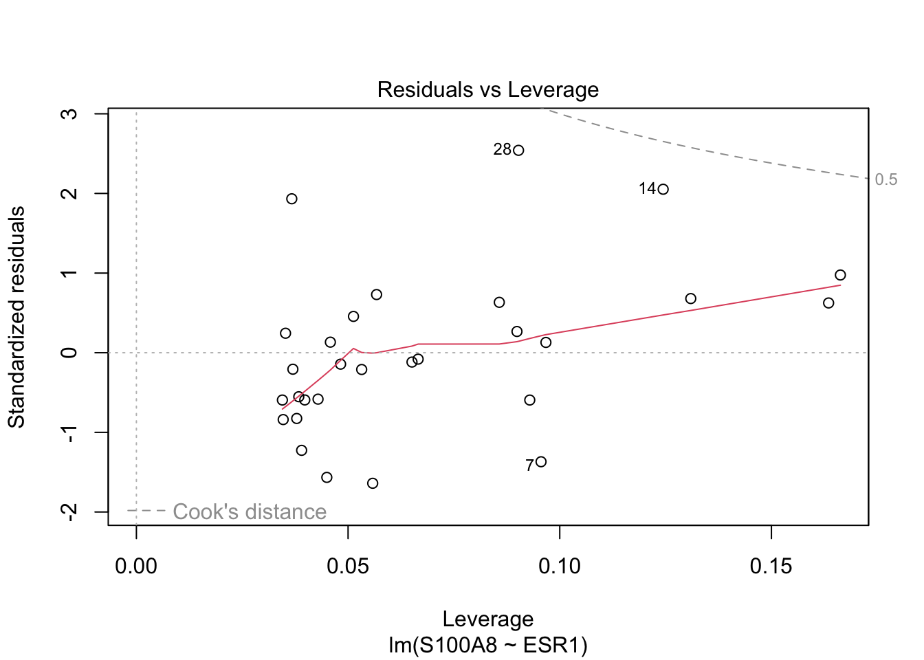
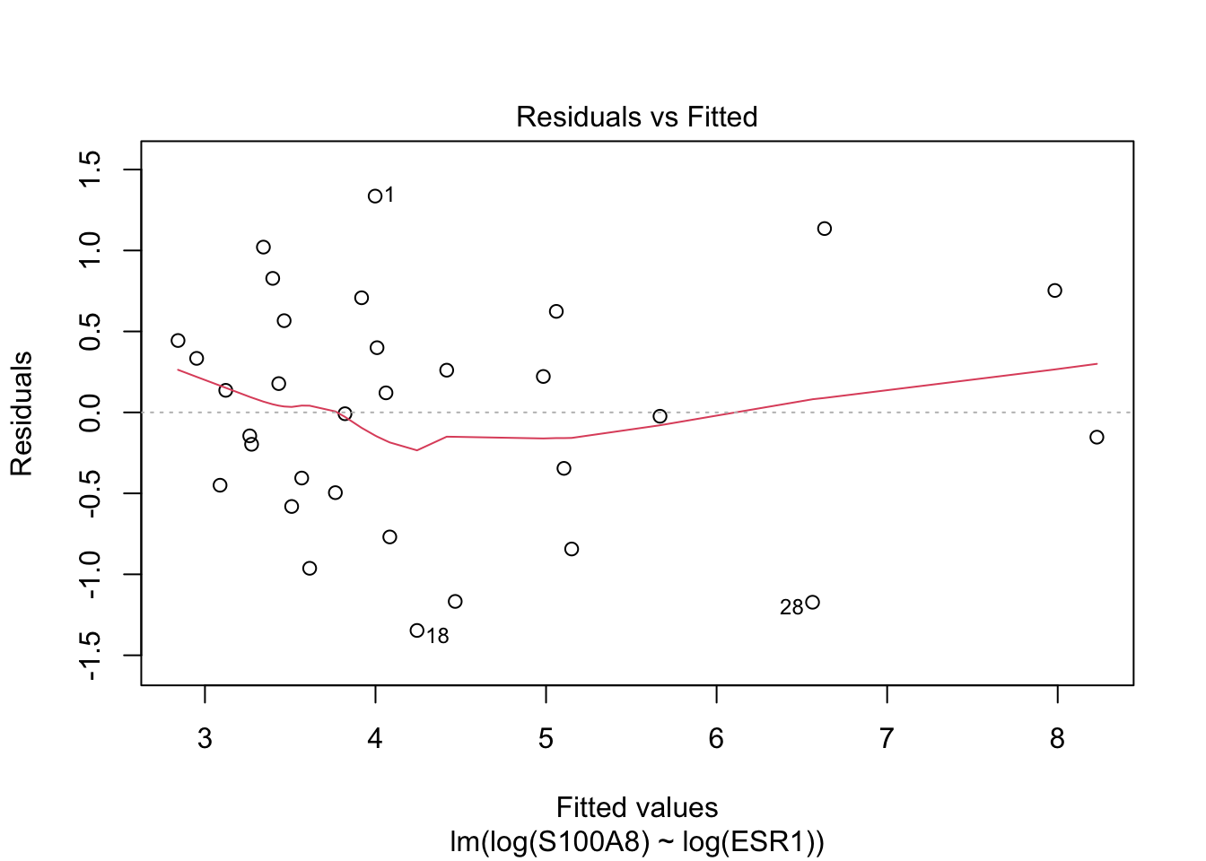
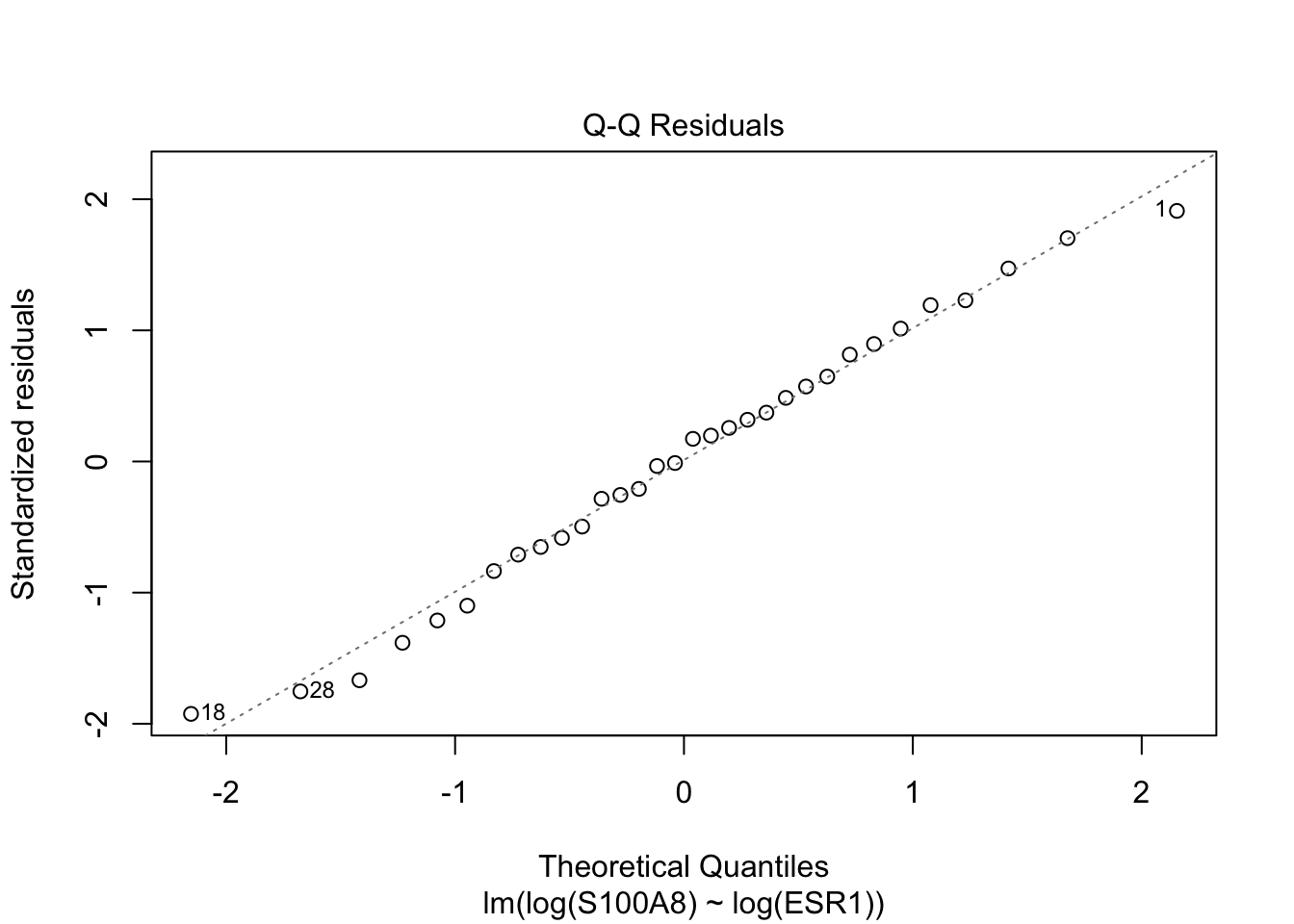
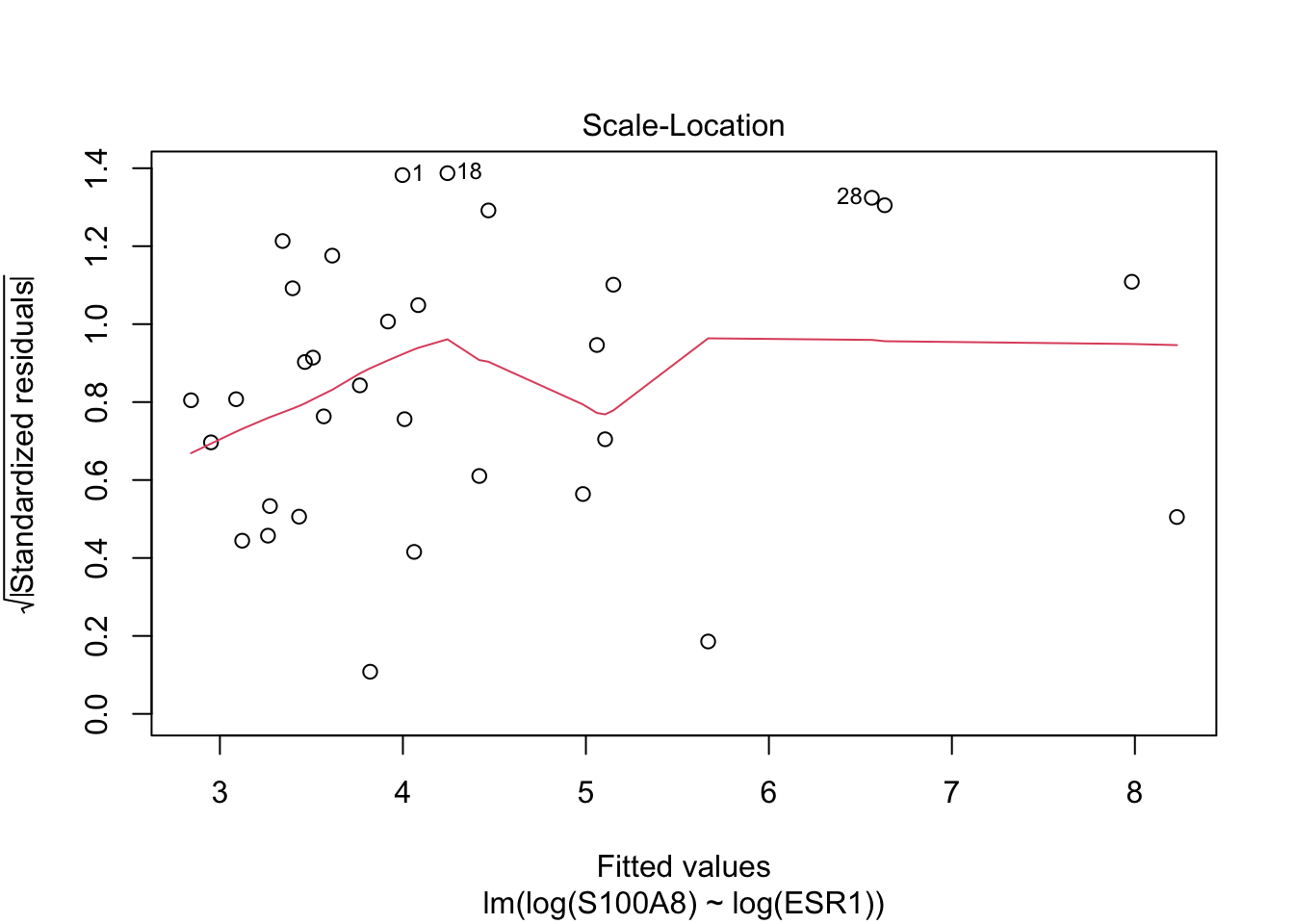
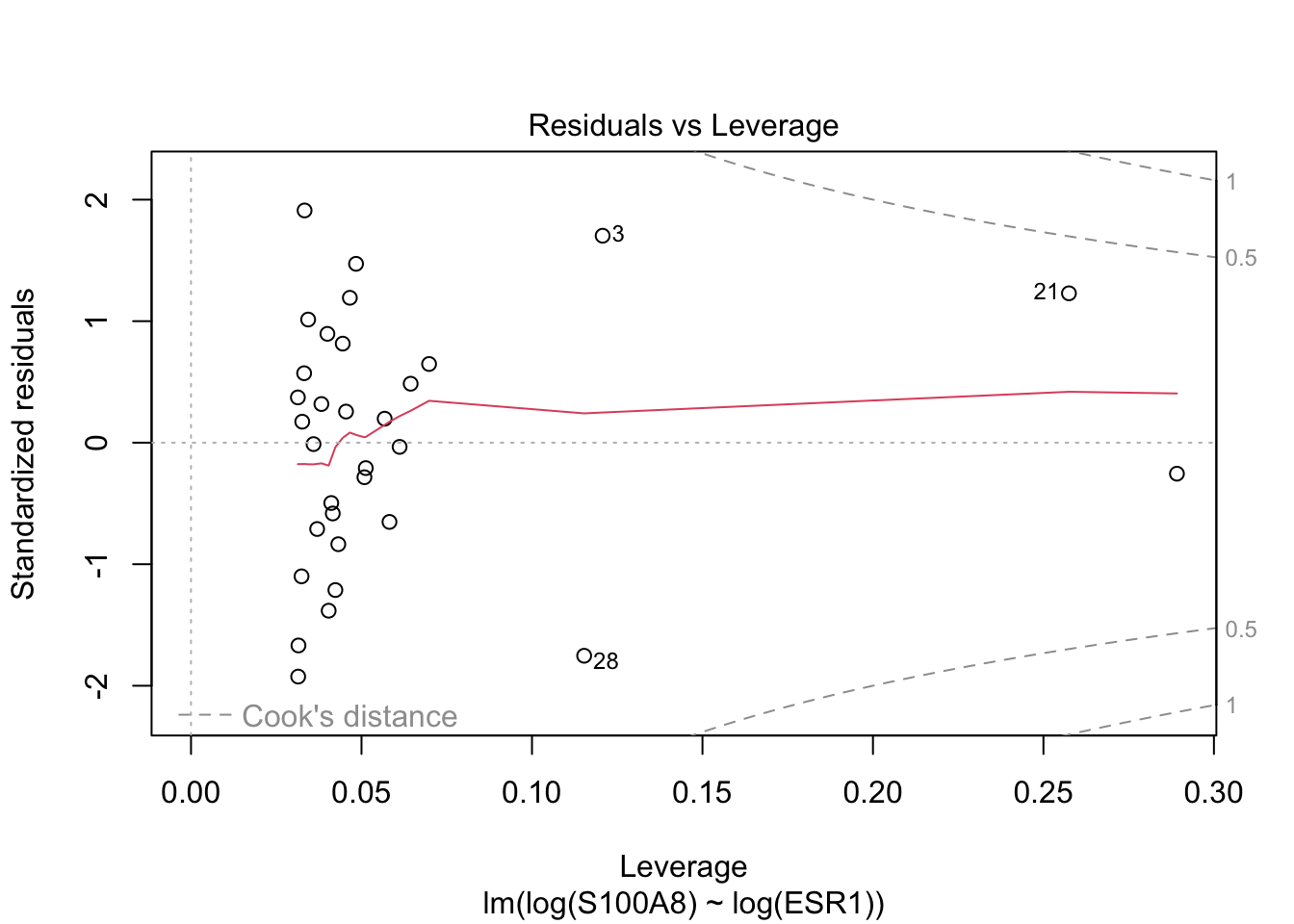
5  Linear models

5.1 Lecture Slides

5.1.1 Statistical modeling

View slides in full screen

5.1.2 Linear models

View slides in full screen

5.2 Lab: simple linear regression

5.2.1 Breast cancer dataset 1

We use a subset of the data from Sotiriou et al. (2006).

The data consist of 32 breast cancer patients with estrogen receptor positive tumors that underwent tamoxifen chemotherapy.

The variables available in the dataset are:

  • grade: histological grade of tumor (grade 1 vs 3);
  • node: lymph node status (0: not affected, 1: lymph nodes affected and removed);
  • size: tumor size in cm;
  • age: patient’s age in years;
  • ESR1 and S100A8 gene expression in tumor biopsy (microarray technology).

Read the data and glimpse at the data.

library(tidyverse)
theme_set(theme_minimal(base_size = 20))

brca <- read_csv("slides/data/breastcancer.csv")
glimpse(brca)
Rows: 32
Columns: 10
$ sample_name <chr> "OXFT_209", "OXFT_1769", "OXFT_2093", "OXFT_1770", "OXFT_1…
$ filename    <chr> "gsm65344.cel.gz", "gsm65345.cel.gz", "gsm65347.cel.gz", "…
$ treatment   <chr> "tamoxifen", "tamoxifen", "tamoxifen", "tamoxifen", "tamox…
$ er          <dbl> 1, 1, 1, 1, 1, 1, 1, 1, 1, 1, 1, 1, 1, 1, 1, 1, 1, 1, 1, 1…
$ grade       <dbl> 3, 1, 1, 1, 3, 3, 1, 3, 1, 3, 3, 1, 3, 1, 1, 1, 1, 3, 1, 3…
$ node        <dbl> 1, 1, 1, 1, 0, 1, 1, 0, 0, 0, 0, 0, 0, 0, 0, 0, 0, 1, 1, 0…
$ size        <dbl> 2.5, 3.5, 2.2, 1.7, 2.5, 1.4, 3.3, 2.4, 1.7, 3.5, 1.4, 2.0…
$ age         <dbl> 66, 86, 74, 69, 62, 63, 76, 61, 62, 65, 63, 70, 78, 71, 68…
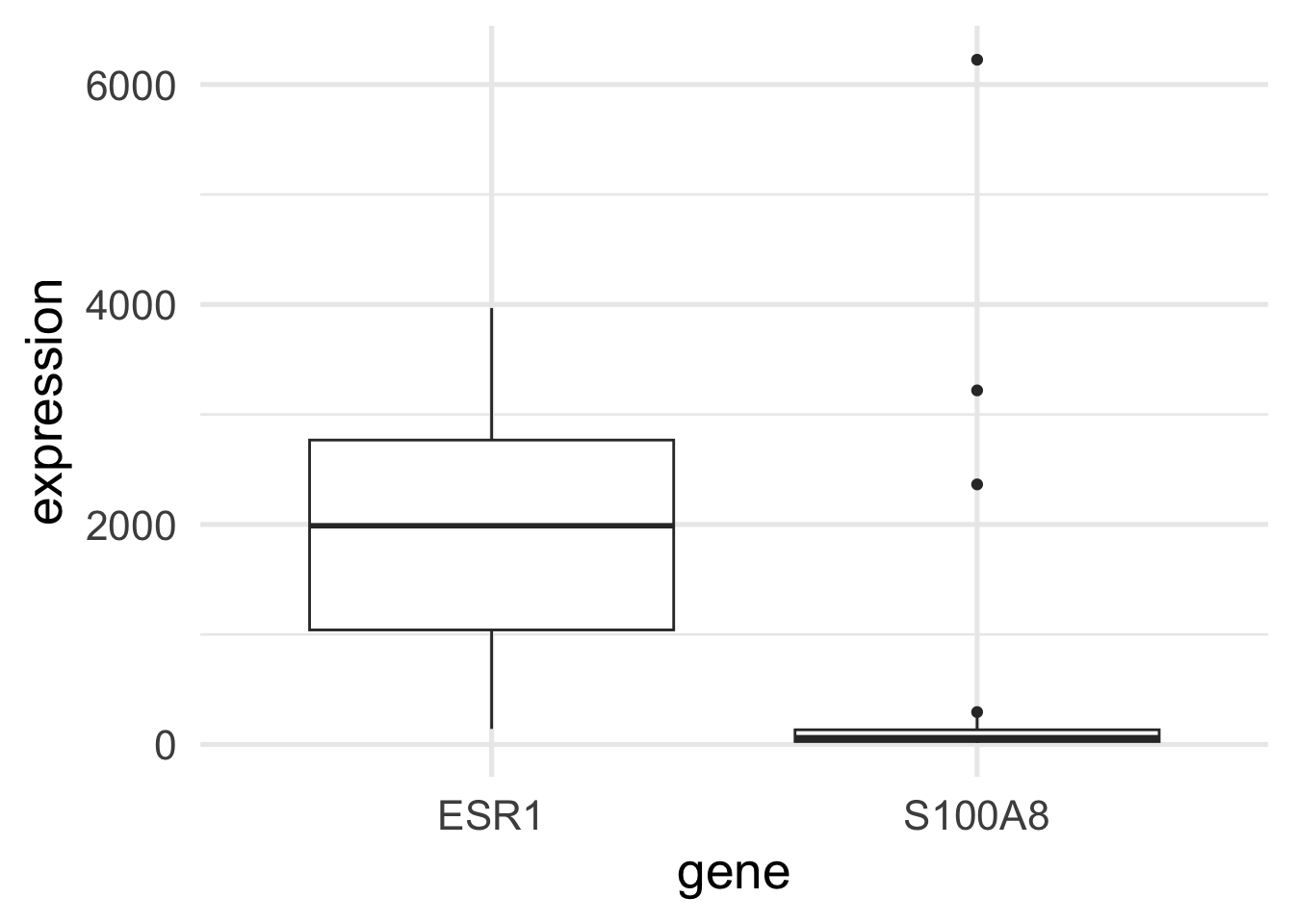
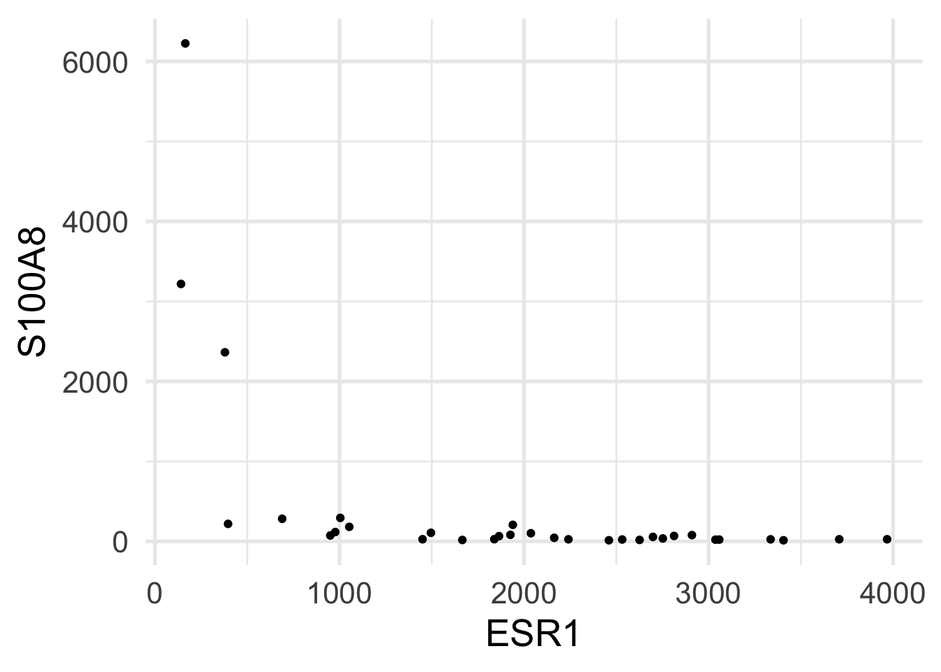
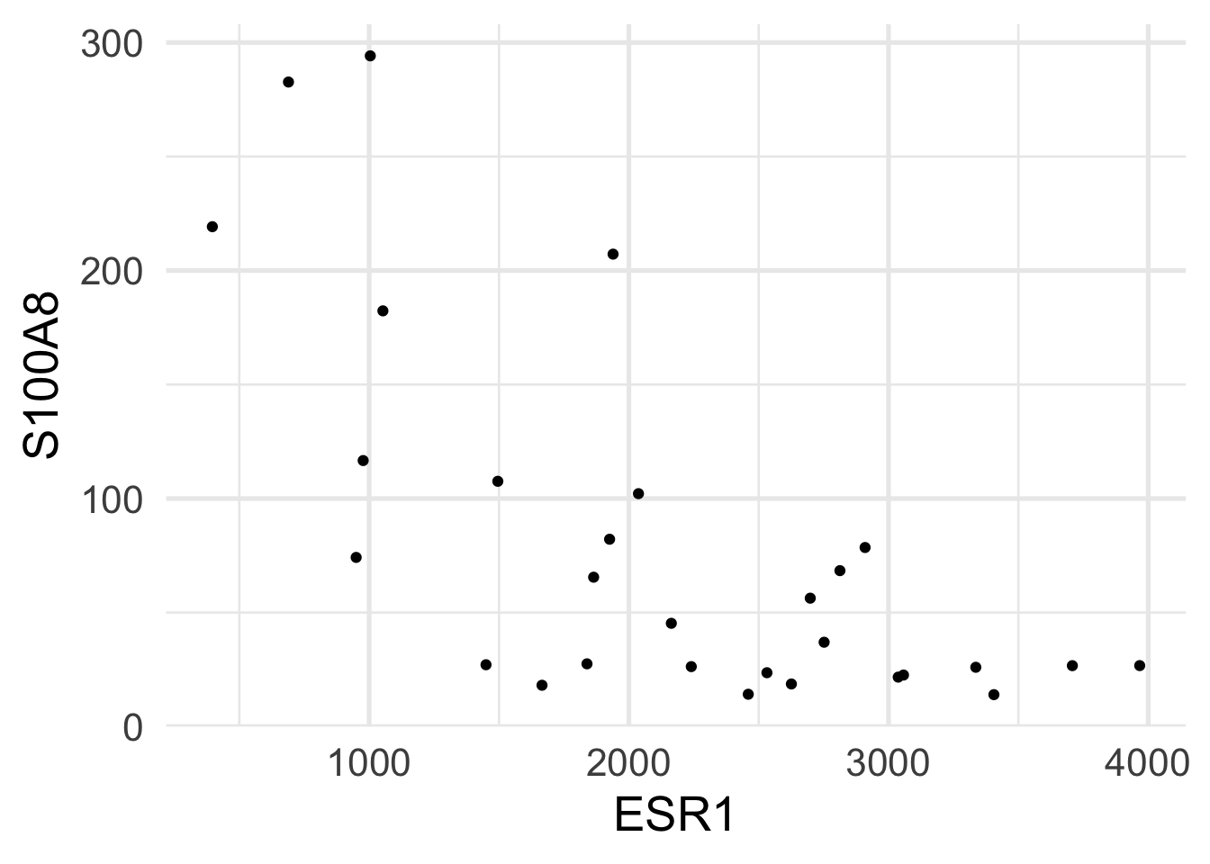
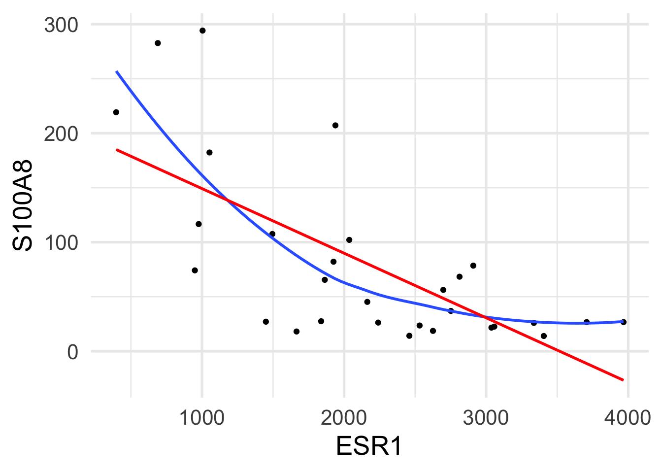
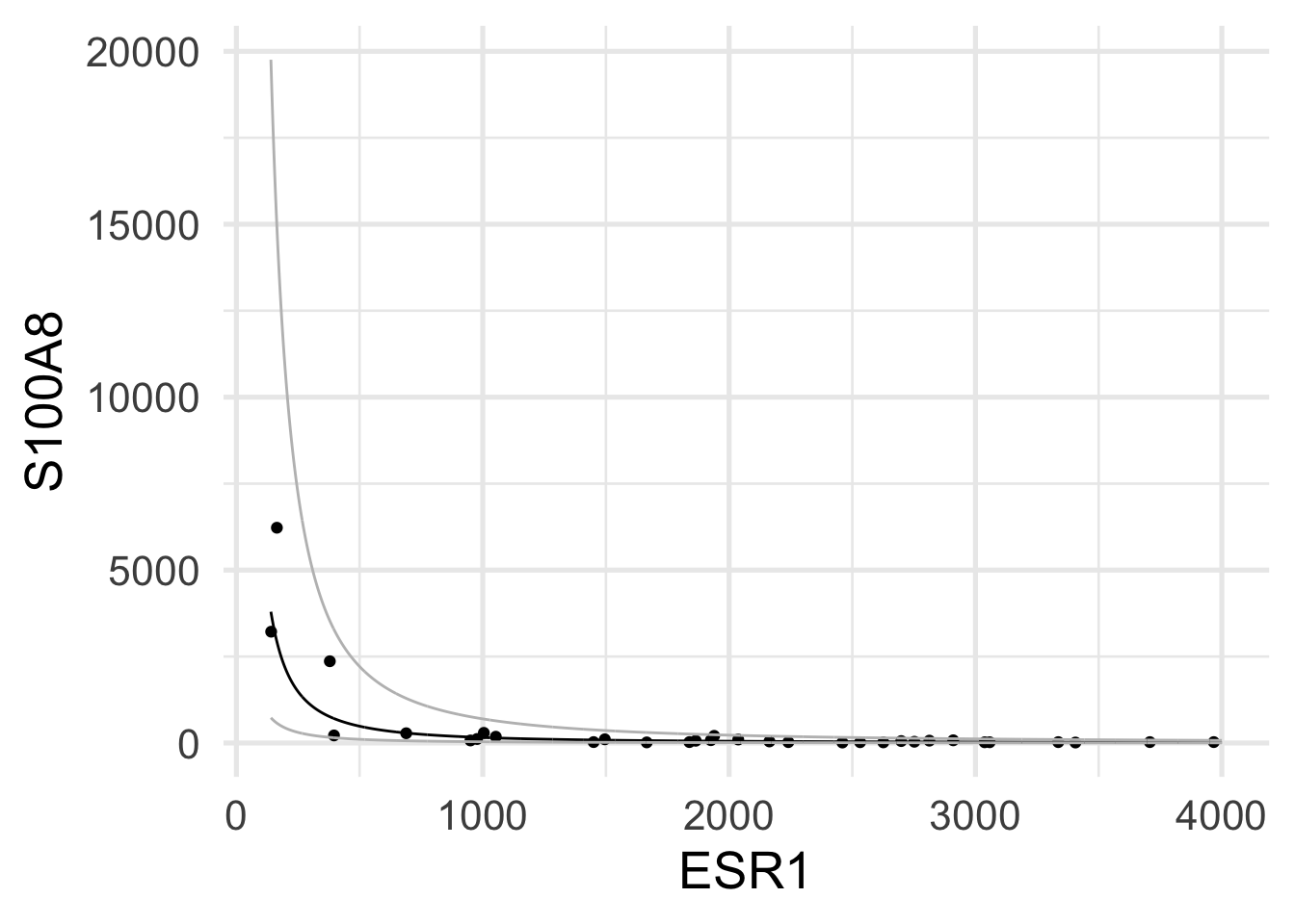
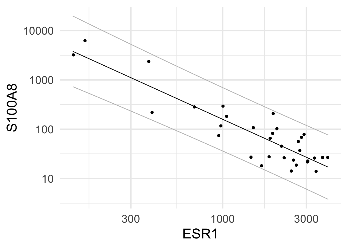
$ ESR1        <dbl> 1939.1990, 2751.9521, 379.1951, 2531.7473, 141.0508, 1495.…
$ S100A8      <dbl> 207.19682, 36.98611, 2364.18306, 23.61504, 3218.74109, 107…

The goal is to study whether there is an association between the expression of ESR1 (Estrogen Receptor 1) and S100A8, a gene encoding for a calcium binding protein, involved in cell cycle progression and differentiation.

5.2.2 Data wrangling and exploration

First, we want to turn the categorical variables into factors.

brca <- brca |>
    mutate(grade = factor(grade), node = factor(node), 
           er = factor(er), treatment = factor(treatment)) 
brca
# A tibble: 32 × 10
   sample_name filename     treatment er    grade node   size   age  ESR1 S100A8
   <chr>       <chr>        <fct>     <fct> <fct> <fct> <dbl> <dbl> <dbl>  <dbl>
 1 OXFT_209    gsm65344.ce… tamoxifen 1     3     1       2.5    66 1939.  207. 
 2 OXFT_1769   gsm65345.ce… tamoxifen 1     1     1       3.5    86 2752.   37.0
 3 OXFT_2093   gsm65347.ce… tamoxifen 1     1     1       2.2    74  379. 2364. 
 4 OXFT_1770   gsm65348.ce… tamoxifen 1     1     1       1.7    69 2532.   23.6
 5 OXFT_1342   gsm65350.ce… tamoxifen 1     3     0       2.5    62  141. 3219. 
 6 OXFT_2338   gsm65352.ce… tamoxifen 1     3     1       1.4    63 1495.  108. 
 7 OXFT_2341   gsm65353.ce… tamoxifen 1     1     1       3.3    76 3406.   14.0
 8 OXFT_1902   gsm65354.ce… tamoxifen 1     3     0       2.4    61 2813.   68.4
 9 OXFT_1982   gsm65355.ce… tamoxifen 1     1     0       1.7    62  950.   74.2
10 OXFT_5210   gsm65356.ce… tamoxifen 1     3     0       3.5    65 1053.  182. 
# ℹ 22 more rows

We can now look at the expression of the two genes across the patients.

brca |> pivot_longer(cols = c("ESR1", "S100A8"), names_to = "gene", values_to = "expression") -> brca_long

brca_long |>
    ggplot(aes(gene, expression)) +
    geom_boxplot()

Exercise

Would the distribution of the genes look better in log scale? Repeat the plot log-transforming the y axis

Solution
Code
brca_long |>
    ggplot(aes(gene, expression)) +
    geom_boxplot() +
    scale_y_log10()

Let’s now assess the relation between the two genes.

brca |>
    ggplot(aes(ESR1, S100A8)) +
    geom_point()

It is clear that the scatterplot is influenced by three outliers in the S100A8 gene. We can try to remove them and repeat the plot.

brca |>
    filter(S100A8 < 2000) -> brca_outrm

brca_outrm |>
    ggplot(aes(ESR1, S100A8)) +
    geom_point()

Exercise

Can you think of a different way to improve the visualization that keeps the outliers in the graph?

Solution
Code
brca |>
    ggplot(aes(ESR1, S100A8)) +
    geom_point() +
    scale_y_log10()

Is linear regression a good model for this relationship? We can get a sense of this by fitting a line and a smooth curve to the plot above. We can achieve this by using the geom_smooth() geometry.

brca_outrm |>
    ggplot(aes(ESR1, S100A8)) +
    geom_point() +
    geom_smooth(se = FALSE, span=1) +
    geom_smooth(method = lm, color = "red", se = FALSE)

There may be a non-linear relation between the two genes, but the linear regression fits the points fairly well.

5.2.3 Simple linear regression

Let’s fit a linear model.

fit <- lm(S100A8 ~ ESR1, data=brca_outrm)
summary(fit)

Call:
lm(formula = S100A8 ~ ESR1, data = brca_outrm)

Residuals:
   Min     1Q Median     3Q    Max 
-95.43 -34.81  -6.79  34.23 145.21 

Coefficients:
             Estimate Std. Error t value Pr(>|t|)    
(Intercept) 208.47145   28.57207   7.296 7.56e-08 ***
ESR1         -0.05926    0.01212  -4.891 4.08e-05 ***
---
Signif. codes:  0 '***' 0.001 '**' 0.01 '*' 0.05 '.' 0.1 ' ' 1

Residual standard error: 59.91 on 27 degrees of freedom
Multiple R-squared:  0.4698,    Adjusted R-squared:  0.4502 
F-statistic: 23.93 on 1 and 27 DF,  p-value: 4.078e-05

We can see that we have an \(R^2\) of 0.47, indicating that ESR1 helps explaining the expression of S100A8.

Its coefficient is highly significant and our predicted values are \[ \hat{y} = 208.5 - 0.06 x, \] which means that for each unit increase in the expression of ESR1, S100A8’s expression decreases by 0.06 units.

Exercise
  • What is the predicted S100A8 expression of a patient with ESR1 expression of 1000?
  • What is the predicted S100A8 expression of a patient with ESR1 expression of 3000?
Solution
Code
predict(fit, newdata=data.frame(ESR1=1000))
fit$coefficients[1] + fit$coefficients[2] * 1000
predict(fit, newdata=data.frame(ESR1=3000))
fit$coefficients[1] + fit$coefficients[2] * 3000

5.2.3.1 And the outliers?

What would have happened if we had not taken the outliers out of the analysis?

fit_out <- lm(S100A8 ~ ESR1, data=brca)
summary(fit_out)

Call:
lm(formula = S100A8 ~ ESR1, data = brca)

Residuals:
    Min      1Q  Median      3Q     Max 
-1237.8  -634.6  -191.5   251.4  4620.3 

Coefficients:
             Estimate Std. Error t value Pr(>|t|)    
(Intercept) 1709.4637   409.9006   4.170 0.000239 ***
ESR1          -0.6373     0.1825  -3.493 0.001506 ** 
---
Signif. codes:  0 '***' 0.001 '**' 0.01 '*' 0.05 '.' 0.1 ' ' 1

Residual standard error: 1076 on 30 degrees of freedom
Multiple R-squared:  0.2891,    Adjusted R-squared:  0.2654 
F-statistic:  12.2 on 1 and 30 DF,  p-value: 0.001506

We see that the outliers have a huge impact on the analysis. The \(R^2\) significantly drops, the significance of the coefficient is much less (although it is still significantly different from 0), and its value is a lot further from 0.

In fact, this model indicates that for each unit increase in the expression of ESR1, S100A8’s expression decreases by 0.64 units.

Exercise

According to this new model:

  • What is the predicted S100A8 expression of a patient with ESR1 expression of 1000?
  • What is the predicted S100A8 expression of a patient with ESR1 expression of 3000?
Solution
Code
predict(fit_out, newdata=data.frame(ESR1=1000))
fit_out$coefficients[1] + fit_out$coefficients[2] * 1000
predict(fit_out, newdata=data.frame(ESR1=3000))
fit_out$coefficients[1] + fit_out$coefficients[2] * 3000

Which model is correct? Should we include the outliers or not? Is there an alternative?

5.2.3.2 Transforming the predictor

Remember that the linear model is linear in the coefficients, meaning that we can transform the scale of the variables if we think that this better reflects their nature. In fact, microarray technologies are based on fluorescence intensities, which typically show a skewed, positive distribution and may benefit from a log transformation.

brca |>
    ggplot(aes(log(ESR1), log(S100A8))) +
    geom_point() +
    geom_smooth(se = FALSE) +
    geom_smooth(method = lm, color = "red", se = FALSE)

Now the relation looks a lot more linear than in the linear scale.

We can fit this new model.

fit_log <- lm(log(S100A8) ~ log(ESR1), data=brca)
summary(fit_log)

Call:
lm(formula = log(S100A8) ~ log(ESR1), data = brca)

Residuals:
     Min       1Q   Median       3Q      Max 
-1.34664 -0.46120  0.05631  0.47458  1.33579 

Coefficients:
            Estimate Std. Error t value Pr(>|t|)    
(Intercept)   16.221      1.111   14.60 3.57e-15 ***
log(ESR1)     -1.615      0.150  -10.76 8.07e-12 ***
---
Signif. codes:  0 '***' 0.001 '**' 0.01 '*' 0.05 '.' 0.1 ' ' 1

Residual standard error: 0.7109 on 30 degrees of freedom
Multiple R-squared:  0.7942,    Adjusted R-squared:  0.7874 
F-statistic: 115.8 on 1 and 30 DF,  p-value: 8.07e-12

With this model we get a very high \(R^2\) of 0.79 and a highly significant association between the two genes.

The predicted values are now \[ \widehat{\log y} = 16.22 - 1.61 \log x, \] which means that for each unit increase in the log expression of ESR1, S100A8’s log expression decreases by 1.61 units.

Note that a model that is additive in a log scale is multiplicative in the natural scale. As an example, let’s see what happens to two patients: \[ \log \hat{y}_1 = 16.22 - 1.61 \log x_1 \quad \quad \log \hat{y}_2 = 16.22 - 1.61 \log x_2, \] hence \[ \log \hat{y}_2 - \log \hat{y}_1 = -1.61 (\log \hat{x}_2 - \log \hat{x}_1) \] which means \[ \log \left(\frac{\hat{y}_2}{\hat{y}_1}\right) = -1.61 \log \left(\frac{\hat{x}_2}{\hat{x}_1}\right) \] and in the linear scale \[ \frac{\hat{y}_2}{\hat{y}_1} = \left(\frac{\hat{x}_2}{\hat{x}_1}\right)^{-1.61} \] If patient 2 has expression of S100A8 twice that of patient 1, we have that their expression of ESR1 is \[ \hat{y}_2 = 2^{-1.61 } \hat{y}_1 \approx 0.33 \hat{y}_1 \] i.e., approximately \(33\%\) of that of patient 1 (or three times lower).

5.2.4 How to choose a model

We have seen that different modeling choices lead to different results. The question of which model to choose is hence paramount.

There are several considerations to make for this choice.

The first, and perhaps most important, is checking the assumptions of our model. Remember that the main assumptions are:

  • Independence of the errors
  • Linearity
  • Homoscedasticity
  • Normality of the errors (for inference)

For the linearity assumption, one can check the above plots; for this example, it seems that the log-scale is better.

For the other assumptions, we can perform what is known as the analysis of the residuals.

Let’s start from the first model.

plot(fit)

This command produces four graphs:

  1. Residuals vs Fitted - checks linear relationship assumption of linear regression. A linear relationship will demonstrate a horizontal red line here. Deviations from a horizontal line suggest nonlinearity and that a different approach may be necessary.

  2. Normal Q-Q - checks whether or not the residuals (the difference between the observed and predicted values) from the model are normally distributed. The best fit models points fall along the dashed line on the plot. Deviation from this line suggests that a different analytical approach may be required.

  3. Scale-Location - checks the homoscedasticity of the model. A horizontal red line with points equally spread out indicates a well-fit model. A non-horizontal line or points that cluster together suggests that your data are not homoscedastic.

  4. Residuals vs Leverage - helps to identify outlier or extreme values that may disproportionately affect the model’s results. Their inclusion or exclusion from the analysis may affect the results of the analysis. Note that the top three most extreme values are identified with numbers next to the points in all four plots.

In this case, the residuals do not look bad, but there may be a small issue with linearity (first graph) and heteroschedasticity (third graph).

The second model seems slightly better on all analyses.

plot(fit_log)

Exercise

Run the residuals analysis of the linear model without removing the outliers. How would you rate the model fit?

Solution
Code
plot(fit_out)

Ultimately in this case, we can choose the model with the log transformation, which seems better in terms of \(R^2\) and interpretation of the results.

5.2.5 Predictions

Let’s go back to parameter estimation. Here, we have estimated the two regression coefficients, we can also compute confidence intervals for those estimates.

confint(fit_log)
                2.5 %    97.5 %
(Intercept) 13.952114 18.489024
log(ESR1)   -1.921047 -1.308185

This allows us to be more confident on the inferential statements about the relation between the two genes.

However, very often one of the goals of linear modeling is prediction. For instance, we can try and predict what would be the expression value of S100A8 for a patient that shows a value of 2000 for ESR1.

logpred <- predict(fit_log, newdata = data.frame(ESR1 = 2000))
exp(logpred)
       1 
51.83325 

Also in this case it would be more useful to have a prediction interval rather than a point prediction.

When computing prediction intervals we have to “adjust” the confidence interval to take into consideration, in addition to the uncertainty of estimation of the model parameters, the uncertainty of the new observation, which is a stochastic quantity because it is yet to be observed.

grid <- 140:4000
pred <- predict(fit_log, newdata = data.frame(ESR1 = grid), interval = "prediction")
head(pred)
       fit      lwr      upr
1 8.241715 6.592193 9.891237
2 8.230223 6.581678 9.878769
3 8.218812 6.571235 9.866390
4 8.207482 6.560862 9.854101
5 8.196230 6.550560 9.841900
6 8.185056 6.540327 9.829785

We can use these predictions to visually represent the prediction uncertainty of new data points.

newdata <- data.frame(cbind(grid, exp(pred)))
brca |> ggplot(aes(x = ESR1, y = S100A8)) +
    geom_point() +
    geom_line(aes(x = grid, y = fit), newdata) +
    geom_line(aes(x = grid, y = lwr), newdata, color = "grey") +
    geom_line(aes(x = grid, y = upr), newdata, color = "grey")

Note that although the model was fit on the log-transformed variables, here we are visualizing it in the linear scale.

We can of course visualize the model in the log scale, and we will recognize its linear nature.

brca |> ggplot(aes(x = ESR1, y = S100A8)) +
    geom_point() +
    geom_line(aes(x = grid, y = fit), newdata) +
    geom_line(aes(x = grid, y = lwr), newdata, color = "grey") +
    geom_line(aes(x = grid, y = upr), newdata, color = "grey") +
    scale_y_log10() + scale_x_log10()

5.3 Lab: multiple regression

5.3.1 Prostate cancer dataset 2

For this lab we use a dataset that contains measurements of Prostate specific antigen (PSA) and a number of clinical variables for 97 males with radical prostatectomy.

PSA levels can help diagnose prostate cancer: a high level can be a sign of cancer.

Here, we are interested in evaluating the association between PSA and the other available variables, i.e.:

  • tumor volume (lcavol)
  • prostate weight (lweight)
  • age
  • benign prostate hypertrophy (lbph)
  • seminal vesicle invasion (svi)
  • capsular penetration (lcp)
  • Gleason score (gleason)
  • percentage Gleason score 4/5 (pgg45)
prostate <- read_csv("slides/data/prostate.csv")
glimpse(prostate)
Rows: 97
Columns: 9
$ lcavol  <dbl> -0.5798185, -0.9942523, -0.5108256, -1.2039728, 0.7514161, -1.…
$ lweight <dbl> 2.769459, 3.319626, 2.691243, 3.282789, 3.432373, 3.228826, 3.…
$ age     <dbl> 50, 58, 74, 58, 62, 50, 64, 58, 47, 63, 65, 63, 63, 67, 57, 66…
$ lbph    <dbl> -1.3862944, -1.3862944, -1.3862944, -1.3862944, -1.3862944, -1…
$ svi     <chr> "healthy", "healthy", "healthy", "healthy", "healthy", "health…
$ lcp     <dbl> -1.3862944, -1.3862944, -1.3862944, -1.3862944, -1.3862944, -1…
$ gleason <dbl> 6, 6, 7, 6, 6, 6, 6, 6, 6, 6, 6, 6, 7, 7, 7, 6, 7, 6, 6, 6, 6,…
$ pgg45   <chr> "healthy", "healthy", "20", "healthy", "healthy", "healthy", "…
$ lpsa    <dbl> -0.4307829, -0.1625189, -0.1625189, -0.1625189, 0.3715636, 0.7…

As in the previous case, we want to transform categorical variables into factors.

prostate <- prostate |>
    mutate(svi = factor(svi), gleason = factor(gleason),
           pgg45 = factor(pgg45))
prostate
# A tibble: 97 × 9
   lcavol lweight   age   lbph svi       lcp gleason pgg45     lpsa
    <dbl>   <dbl> <dbl>  <dbl> <fct>   <dbl> <fct>   <fct>    <dbl>
 1 -0.580    2.77    50 -1.39  healthy -1.39 6       healthy -0.431
 2 -0.994    3.32    58 -1.39  healthy -1.39 6       healthy -0.163
 3 -0.511    2.69    74 -1.39  healthy -1.39 7       20      -0.163
 4 -1.20     3.28    58 -1.39  healthy -1.39 6       healthy -0.163
 5  0.751    3.43    62 -1.39  healthy -1.39 6       healthy  0.372
 6 -1.05     3.23    50 -1.39  healthy -1.39 6       healthy  0.765
 7  0.737    3.47    64  0.615 healthy -1.39 6       healthy  0.765
 8  0.693    3.54    58  1.54  healthy -1.39 6       healthy  0.854
 9 -0.777    3.54    47 -1.39  healthy -1.39 6       healthy  1.05 
10  0.223    3.24    63 -1.39  healthy -1.39 6       healthy  1.05 
# ℹ 87 more rows
Exercise

Explore the relation between PSA and the other variables with a series of plots.

Solution
Code
prostate |>
    ggplot(aes(y = lpsa, x = lcavol, color=svi)) +
    geom_point()

prostate |>
    ggplot(aes(y = lpsa, x = lcavol, color=factor(gleason))) +
    geom_point()

prostate |>
    ggplot(aes(y = lpsa, x = lweight, color=svi)) +
    geom_point()

5.3.2 Regression model

We can now fit a linear model, including some of the available variables.

fit_pr <- lm(lpsa ~ lcavol + lweight + svi + gleason, data=prostate)
summary(fit_pr)

Call:
lm(formula = lpsa ~ lcavol + lweight + svi + gleason, data = prostate)

Residuals:
    Min      1Q  Median      3Q     Max 
-1.7456 -0.4344  0.0000  0.4979  1.5694 

Coefficients:
            Estimate Std. Error t value Pr(>|t|)    
(Intercept) -0.43053    0.55165  -0.780 0.437176    
lcavol       0.50007    0.08064   6.202 1.66e-08 ***
lweight      0.52053    0.15028   3.464 0.000817 ***
sviinvasion  0.59241    0.21274   2.785 0.006531 ** 
gleason7     0.34034    0.17951   1.896 0.061178 .  
gleason8    -0.02720    0.72707  -0.037 0.970242    
gleason9     0.15597    0.36239   0.430 0.667943    
---
Signif. codes:  0 '***' 0.001 '**' 0.01 '*' 0.05 '.' 0.1 ' ' 1

Residual standard error: 0.7137 on 90 degrees of freedom
Multiple R-squared:  0.6416,    Adjusted R-squared:  0.6177 
F-statistic: 26.85 on 6 and 90 DF,  p-value: < 2.2e-16
Exercise

Comment the output, with particular focus on \(R^2\), coefficient estimates and significance.

5.3.3 Model selection

Is the inclusion of the Gleason score informative or not? Which model is better, with or without such variable?

To test for the global significance of the gleason variable, we can fit a model without it and perform an Analysis of Variance (a.k.a. an F-test) to test the two models.

fit_nogl <- lm(lpsa ~ lcavol + lweight + svi, data=prostate)
summary(fit_nogl)

Call:
lm(formula = lpsa ~ lcavol + lweight + svi, data = prostate)

Residuals:
     Min       1Q   Median       3Q      Max 
-1.72966 -0.45767  0.02814  0.46404  1.57012 

Coefficients:
            Estimate Std. Error t value Pr(>|t|)    
(Intercept) -0.26807    0.54350  -0.493  0.62301    
lcavol       0.55164    0.07467   7.388  6.3e-11 ***
lweight      0.50854    0.15017   3.386  0.00104 ** 
sviinvasion  0.66616    0.20978   3.176  0.00203 ** 
---
Signif. codes:  0 '***' 0.001 '**' 0.01 '*' 0.05 '.' 0.1 ' ' 1

Residual standard error: 0.7168 on 93 degrees of freedom
Multiple R-squared:  0.6264,    Adjusted R-squared:  0.6144 
F-statistic: 51.99 on 3 and 93 DF,  p-value: < 2.2e-16
anova(fit_nogl, fit_pr)
Analysis of Variance Table

Model 1: lpsa ~ lcavol + lweight + svi
Model 2: lpsa ~ lcavol + lweight + svi + gleason
  Res.Df    RSS Df Sum of Sq      F Pr(>F)
1     93 47.785                           
2     90 45.845  3    1.9403 1.2697 0.2896

The residuals sum of squares will always decrease with the addition of a variable (and the \(R^2\) will always increase), but this does not mean that the new variable significantly adds new information in explaining/predicting the response.

In this case, we could decide to drop the gleason variable, but significance is not always the only consideration to make.

Model selection is a very important (and difficult!) problem in statistics.

5.4 Homework 3

Little et al. (2009) assessed the practical values of telemonitoring devices for remote symptom progression monitoring of early-stage Parkinson’s disease patients.

The collected dataset is composed of a range of biomedical voice measurements from 42 people with early-stage Parkinson’s disease recruited to a six-month trial of a telemonitoring device for remote symptom progression monitoring. The recordings were automatically captured in the patient’s homes.

The available variables are: - subject number, - subject age, - subject gender, - time interval from baseline recruitment date, - motor UPDRS (Unified Parkinson’s Disease Rating Scale), - total UPDRS (Unified Parkinson’s Disease Rating Scale), - and 16 biomedical voice measures.

Each row corresponds to one of 5,875 voice recording from these individuals. The main aim of the data is to predict the motor and total UPDRS scores (‘motor_UPDRS’ and ‘total_UPDRS’) from the 16 voice measures.

The data are available here.

5.4.1 Guided solution

  1. Read the original paper to familiarize yourself with the research and the data (an open-access version is available here). Pay special attention to the definition of the measurements.
  2. Download and unzip the data folder.
  3. Read the data (parkinsons+telemonitoring/parkinsons_updrs.data) with the read_csv function from the readr package.
  4. Exploratory Analysis:
    • explore the pattern of the 16 measures and the two UPDRS scores over time per patient
  5. Patient-level data:
    • use the group_by and summarize_all functions to compute the mean and standard deviation per patient of each of the 16 voice measures and the mean per patient of the two UPDRS scores.
  6. Patient-level EDA:
    • explore the correlation between the 16 biomedical voice measures
    • explore the correlation between each of them and the motor UPDRS score
  7. Fit a linear model using total_UPDRS as a response variable, and as covariates
    • a subset of the 16 mean and variance measures that seem to be informative, and
    • the patients clinical information (e.g., age and sex)

Note: be careful about collinearity or near-collinearity in the data, e.g., between different Jitter measurements.

5.5 Further reading

References

Knuth, Donald E. 1984. “Literate Programming.” Comput. J. 27 (2): 97–111. https://doi.org/10.1093/comjnl/27.2.97.
Little, Max A, Patrick E McSharry, Eric J Hunter, Jennifer Spielman, and Lorraine O Ramig. 2009. “Suitability of Dysphonia Measurements for Telemonitoring of Parkinson’s Disease.” IEEE Transactions on Biomedical Engineering 56 (4): 1015–22.
Sotiriou, Christos, Pratyaksha Wirapati, Sherene Loi, Adrian Harris, Steve Fox, Johanna Smeds, Hans Nordgren, et al. 2006. “Gene Expression Profiling in Breast Cancer: Understanding the Molecular Basis of Histologic Grade to Improve Prognosis.” Journal of the National Cancer Institute 98 (4): 262–72.
Wolff, Jonas O, and Stanislav N Gorb. 2013. “Radial Arrangement of Janus-Like Setae Permits Friction Control in Spiders.” Scientific Reports 3 (1): 1101.

  1. this example is from the Practical Statistics for the Life Sciences course↩︎

  2. this example is from the Practical Statistics for the Life Sciences course↩︎

  3. This homework is based on data from the UC Irvine Machine Learning Repository.↩︎