# A tibble: 6 × 6
  country     continent  year lifeExp      pop gdpPercap
  <fct>       <fct>     <int>   <dbl>    <int>     <dbl>
1 Afghanistan Asia       1952    28.8  8425333      779.
2 Afghanistan Asia       1957    30.3  9240934      821.
3 Afghanistan Asia       1962    32.0 10267083      853.
4 Afghanistan Asia       1967    34.0 11537966      836.
5 Afghanistan Asia       1972    36.1 13079460      740.
6 Afghanistan Asia 1977 38.4 14880372 786.Data visualization
Advanced Statistics and Data Analysis
Davide Risso
Introduction
What is statistics
Statistics is the art of making numerical conjectures about puzzling questions.
Freedman et al., 1978.
Statistics is the art and science of designing studies and analyzing the data that those studies produce.
Its ultimate goal is translating data into knowledge and understanding of the world around us.
In short, statistics is the art and science of learning from data.
The role of statistics
- Design: planning how to obtain data to answer the questions of interest.
- Description: summarizing the data that are obtained.
- Inference: making decisions and predictions based on the data.
Sample and population
The population is the set of subjects in which we are interested.
The sample is the subset of the population for whom we have (or plan to have) data.
Examples:
- Consumi Delle Famiglie (ISTAT). Sample: 28.000 families in all cities; population: all Italian families.
- IPSOS exit polls. Sample: 1000 electors, population: all Italian relevant voters.
- A census is a complete enumeration.
Descriptive and Inferential Statistics
Descriptive statistics refers to methods for summarizing the data. The summaries usually consist of graphs and numbers such as averages and percentages.
Inferential statistics refers to methods for making predictions or decisions about a population, based on data obtained from a sample of that population.
Example: confidence intervals
Of 834 people in a survey, 54.0\(\%\) say they favor handgun control. Using statistical methods, we infer that there is 95\(\%\) confidence that the true proportion is between 50.6\(\%\) and 57.4\(\%\).
Graphical and numerical summaries
Data
The data consist of one or more variables measured/recorded on observational units in a population (cf. census) or sample of the population of interest.
The term variable refers to characteristics that differ among observational units.
Variables
We usually distinguish the following two main types of variables.
- Quantitative / Numerical.
- Qualitative / Categorical.
Quantitative Variables
Quantitative variables can be
- Continuous (cf. real numbers): any value corresponding to the points in an interval. E.g. blood pressure, height.
- Discrete (cf. integers): countable number of values. E.g. number of events per year.
Qualitative variables
Qualitative variables can be
- Nominal: names or labels, no natural order. E.g. Sex, ethnicity, eye color
- Ordinal: ordered categories, no natural numerical scale. E.g. Muscle tone, tumor grade.
Tidy data
The concept of tidy data was introduced by Hadley Wickham in his seminal paper (Wickham, 2014).
There are three fundamental rules which make a dataset tidy:
- Each variable must have its own column.
- Each observation must have its own row.
- Each value must have its own cell.
The advantage of tidy data is both conceptual and practical: it allows to have consistency between datasets and to use tools designed for this data structure.
Distribution
The term distribution refers to the frequencies of one or more (quantitative or qualitative) variables recorded on units in a population or sample of interest.
A distribution table is a table of
- absolute frequencies (i.e., counts) or
- relative frequencies (i.e., percentages)
for the values taken on by the variable(s) in the group of interest.
Population distribution:
- distribution of variables for units in a population;
- population parameters: functions, i.e., summaries, of the population distribution.
Empirical/Sample distribution:
- distribution of variables for units in a sample;
- sample statistics: functions, i.e., summaries, of the empirical distribution.
Example: life expectancy
# A tibble: 1,704 × 6
   country     continent  year lifeExp      pop gdpPercap
   <fct>       <fct>     <int>   <dbl>    <int>     <dbl>
 1 Afghanistan Asia       1952    28.8  8425333      779.
 2 Afghanistan Asia       1957    30.3  9240934      821.
 3 Afghanistan Asia       1962    32.0 10267083      853.
 4 Afghanistan Asia       1967    34.0 11537966      836.
 5 Afghanistan Asia       1972    36.1 13079460      740.
 6 Afghanistan Asia       1977    38.4 14880372      786.
 7 Afghanistan Asia       1982    39.9 12881816      978.
 8 Afghanistan Asia       1987    40.8 13867957      852.
 9 Afghanistan Asia       1992    41.7 16317921      649.
10 Afghanistan Asia       1997    41.8 22227415      635.
# ℹ 1,694 more rows Min. 1st Qu. Median Mean 3rd Qu. Max.
23.60 48.20 60.71 59.47 70.85 82.60 Numerical and graphical summaries
As illustrated by the previous example, it is often more informative to provide a summary of the data rather than to look at all of them.
Data summaries can be either numerical or graphical and allow us to:
- Focus on the main characteristics of the data.
- Reveal unusual features of the data.
- Summarize relationship between variables.
When do we need summaries?
- Exploration: to help you better understand and discover hidden patterns in the data.
- Explanation: to communicate insights to others.
Exploratory Data Analysis (EDA)
Exploratory Data Analysis (EDA) is a key step of any data analysis and of statistical practice in general.
Before formally modeling the data, the dataset must be examined to get a “first impression” of the data and to reveal expected and unexpected characteristics of the data.
It is also useful to examine the data for outlying observations and to check the plausibility of the assumptions of candidate statistical models.
Communication of the results
Explanatory plots (and tables) are equally important. They are often done at the end of the analysis to communicate the results to others.
The main goal is to communicate your main findings:
- focus the attention on the important part of the plot
- make it easy to understand the information (colors, labels)
Combining accuracy with aesthetics
A good visualization should be aesthetically pleasing.
However, the most important aspect of data visualization is accuracy: a graph should never be misleading and aesthetics should never come at the price of inaccuracy.
How to visualize data
A first example
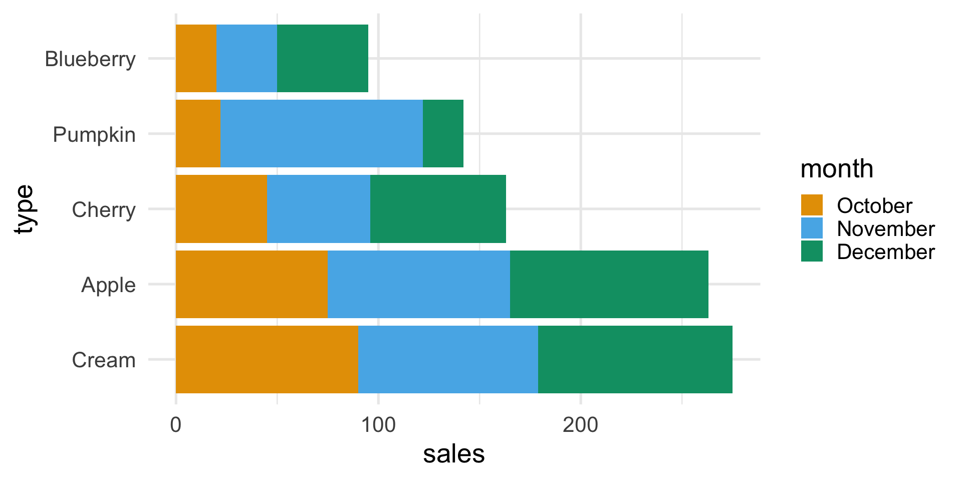
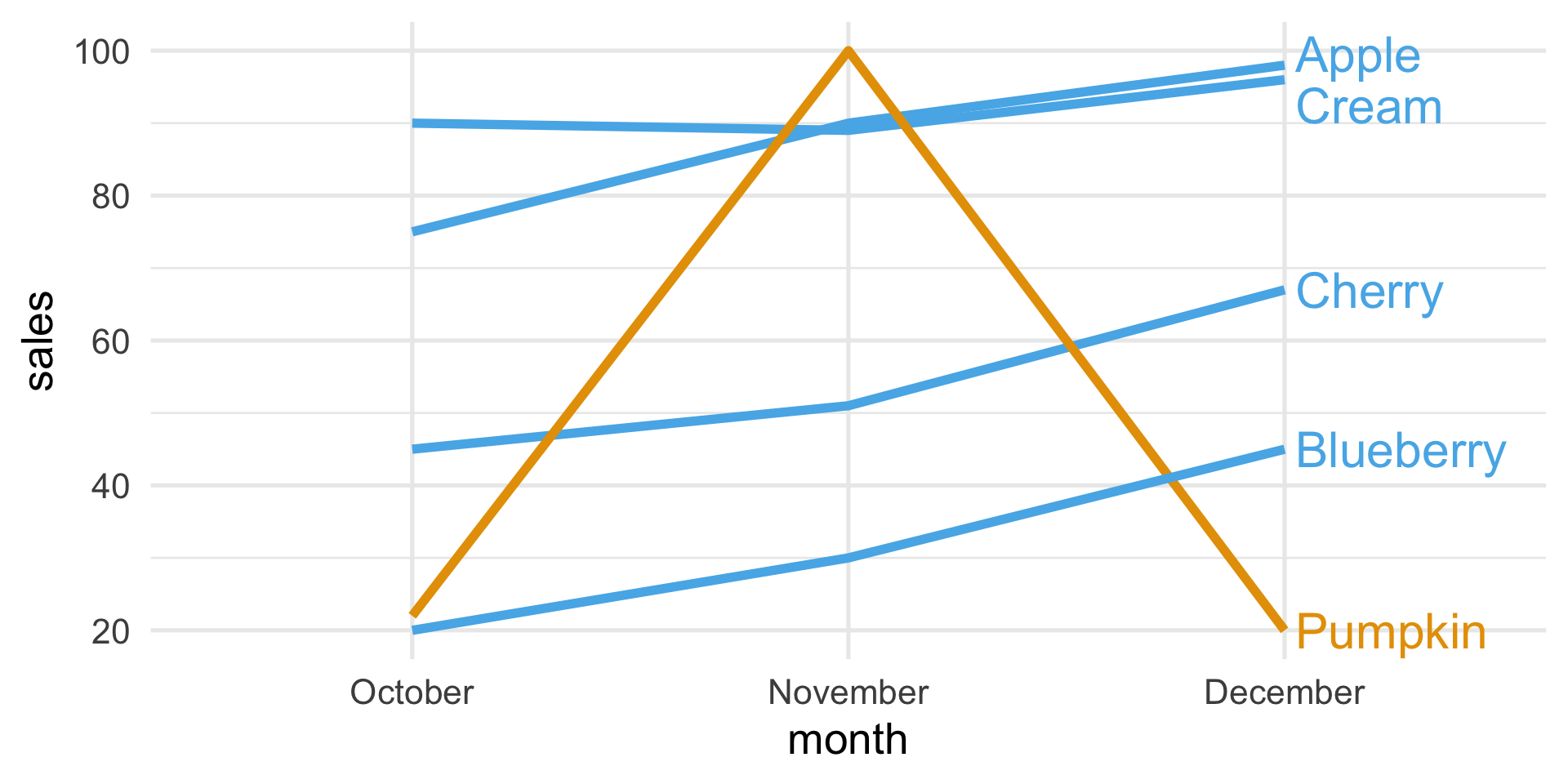
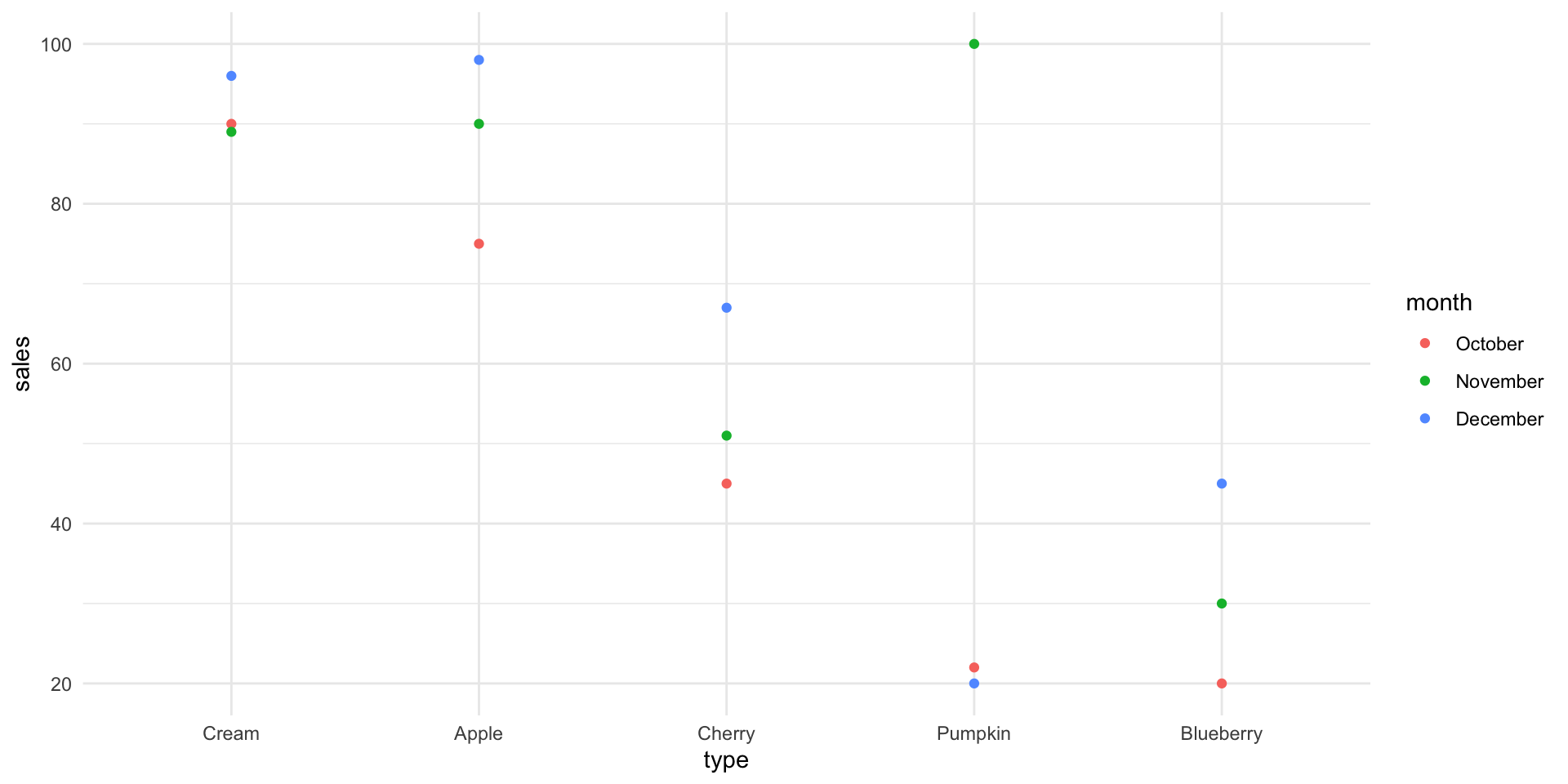
Suppose that a bakery produces five different types of pie and that the sales of these pies in the last three months were:
| Type | October | November | December |
|---|---|---|---|
| Apple | 75 | 90 | 98 |
| Cherry | 45 | 51 | 67 |
| Blueberry | 20 | 30 | 45 |
| Cream | 90 | 89 | 96 |
| Pumpkin | 22 | 100 | 20 |
A bad plot
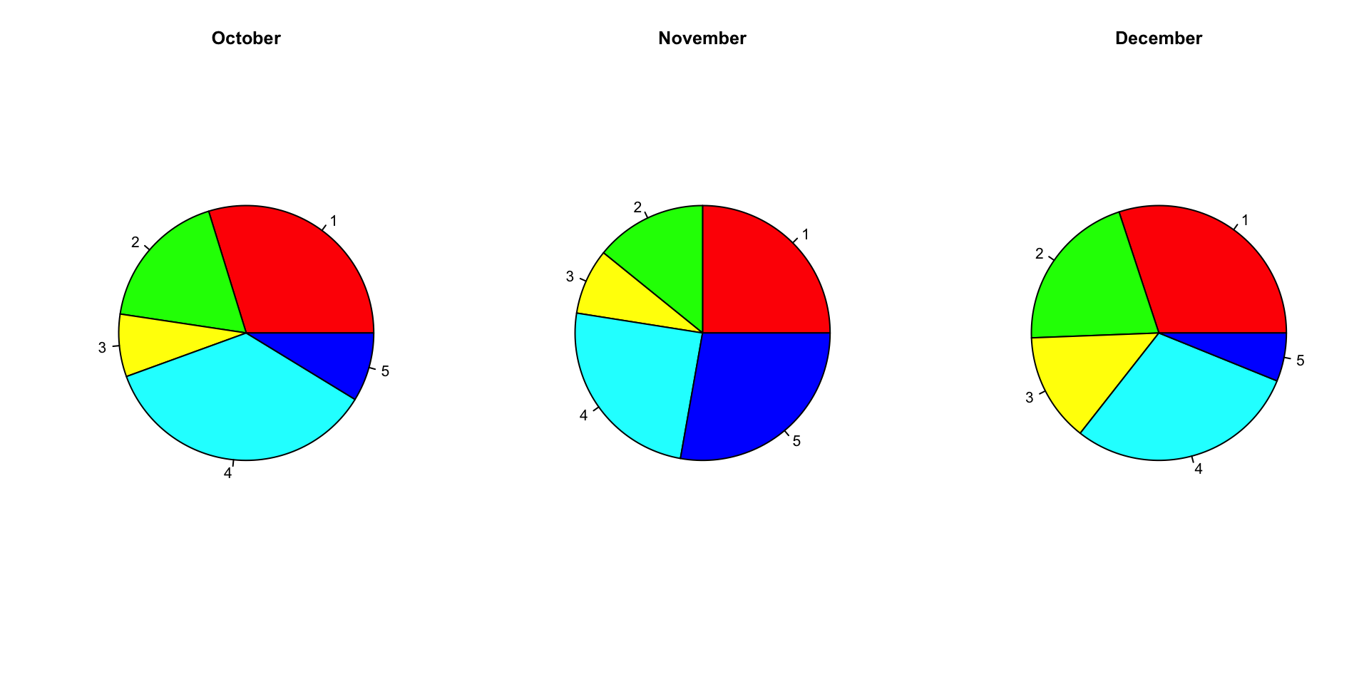
A differently bad plot
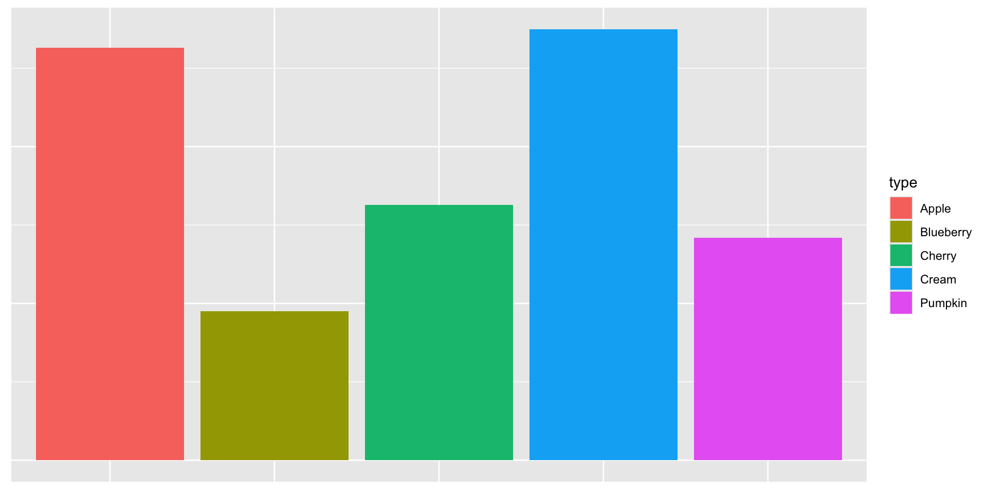
A better plot
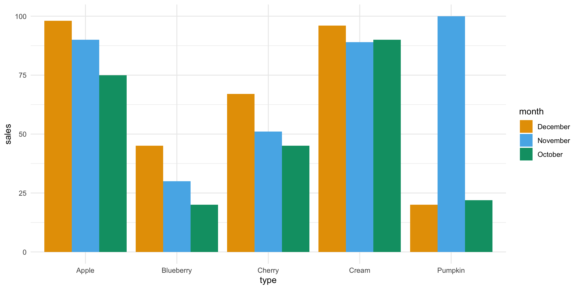
A better plot
A plot that chooses what to highlight
The Grammar of Graphics
- Aesthethics (
aes()): translates the data into the position, shape, size, color, and type of the elements of a plot.
- Geometry (
geom_*()): selects the type of plot that will be displayed, e.g., lines, points, bars or heatmaps.
The Grammar of Graphics (ggplot2)
In R, the ggplot2 package allows you to translate the theory into practice.
The Grammar of Graphics (ggplot2)
In R, the ggplot2 package allows you to translate the theory into practice.
Visualizing distributions
Visualizing distributions
Often, we want to understand what is the empirical distribution of a variable in a dataset.
Perhaps we want to understand if the Gaussian distribution is a good approximation for our data, or we want to see whether the observations that we collected are uniform across age groups, etc.
In this case, we need a way to estimate the variable’s distribution and then visualize it.
For the univariate case, the two most popular choices are histograms and kernel density estimates.
Histograms
A histogram is used to display numerical variables, by aggregating similar values into “bins” to represent the distribution.
This can be easily done with the following steps:
- Partition the real line into intervals (bins).
- Assign each observation to its bin depending on its numerical value.
- Possibly scale the height of the bins so that the total area of the histogram is 100%
Step 3 ensures that the area of each bin represents the percentage of observations in that block.
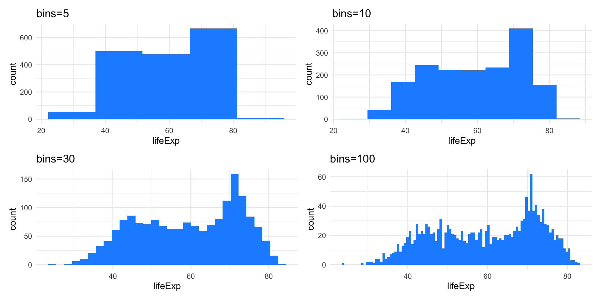
Example: Life expectancy
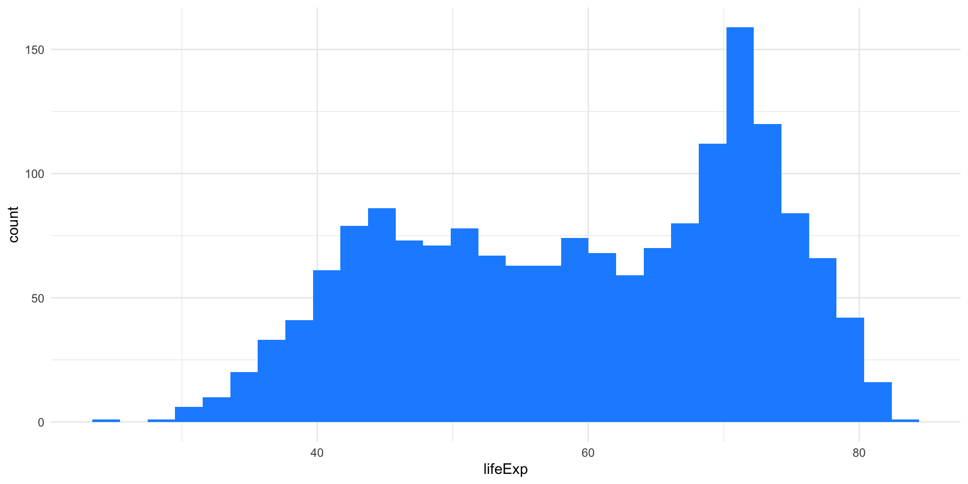
How to choose the bins
The histogram representation of the data depends on two critical choices:
- The number of bins / the bin width
- The location of the bin boundaries.
Note that the number of bins in the histogram controls the amount of information loss: the larger the bin width the more information we lose.
Example: Life expectancy
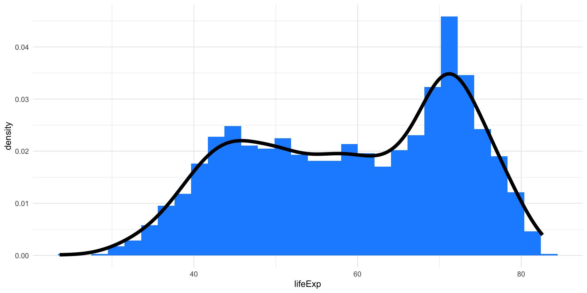
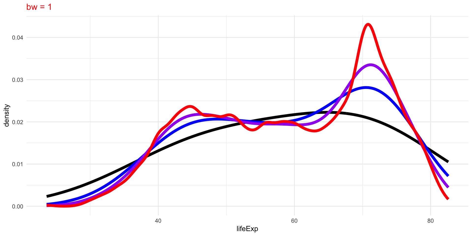
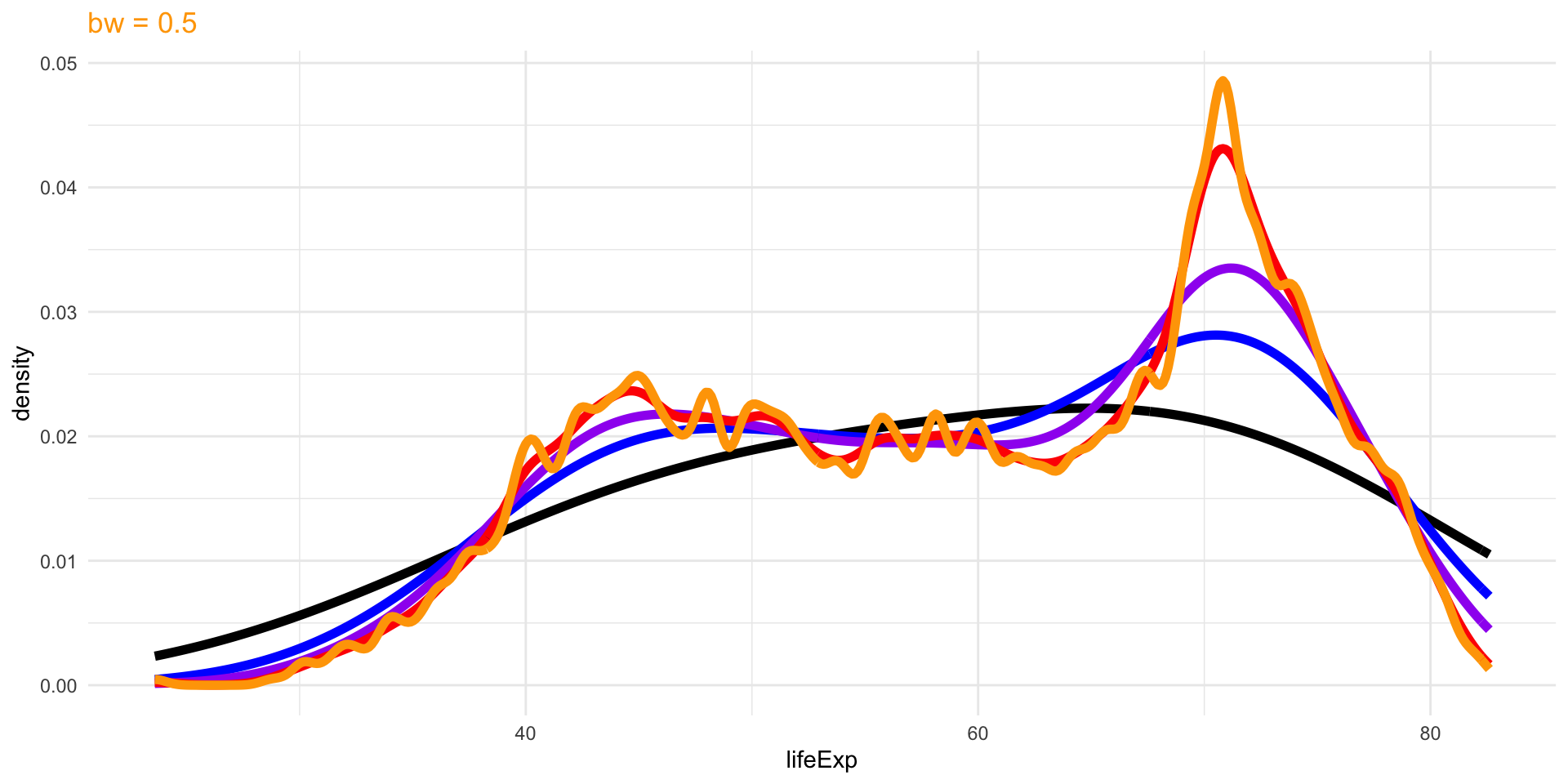
Density Plots
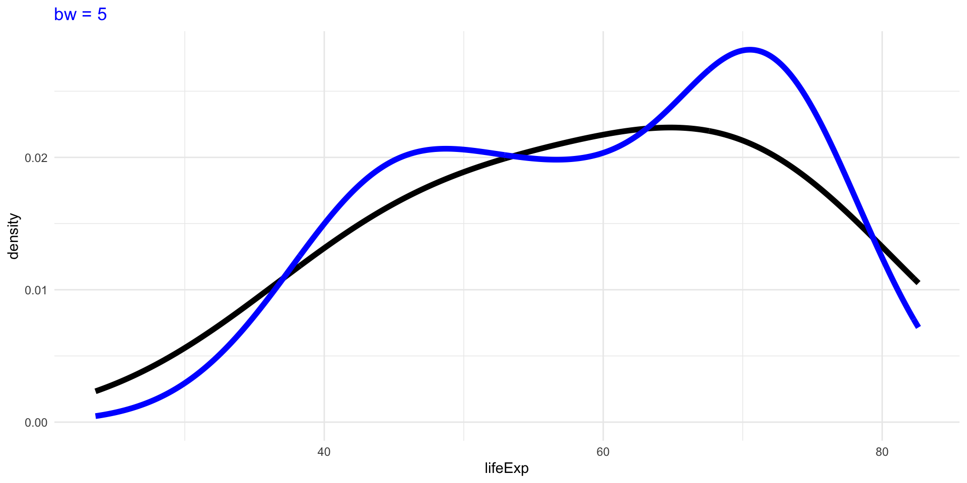
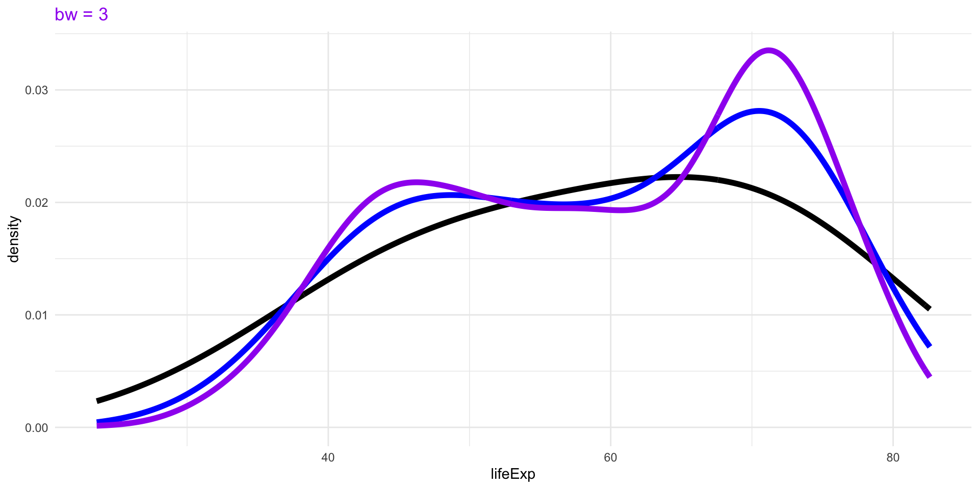
Density plots are smoothed versions of histograms, obtained using kernel density estimation methods.
Density Plots
Density Plots
The choice of bandwidth, similarly to the number of bins in a histogram, determines the smoothness of the density.
There is a bias-variance trade-off in the choice of the bandwidth:
- the larger the bandwidth, the smoother the density (low variance, high bias)
- the smaller the bandwidth, the less smooth (high variance, low bias)
Density Plots

Density Plots
Density Plots
Density Plots
Density Plots
Numerical Summaries of One Variable
Numerical Summaries of One Variable
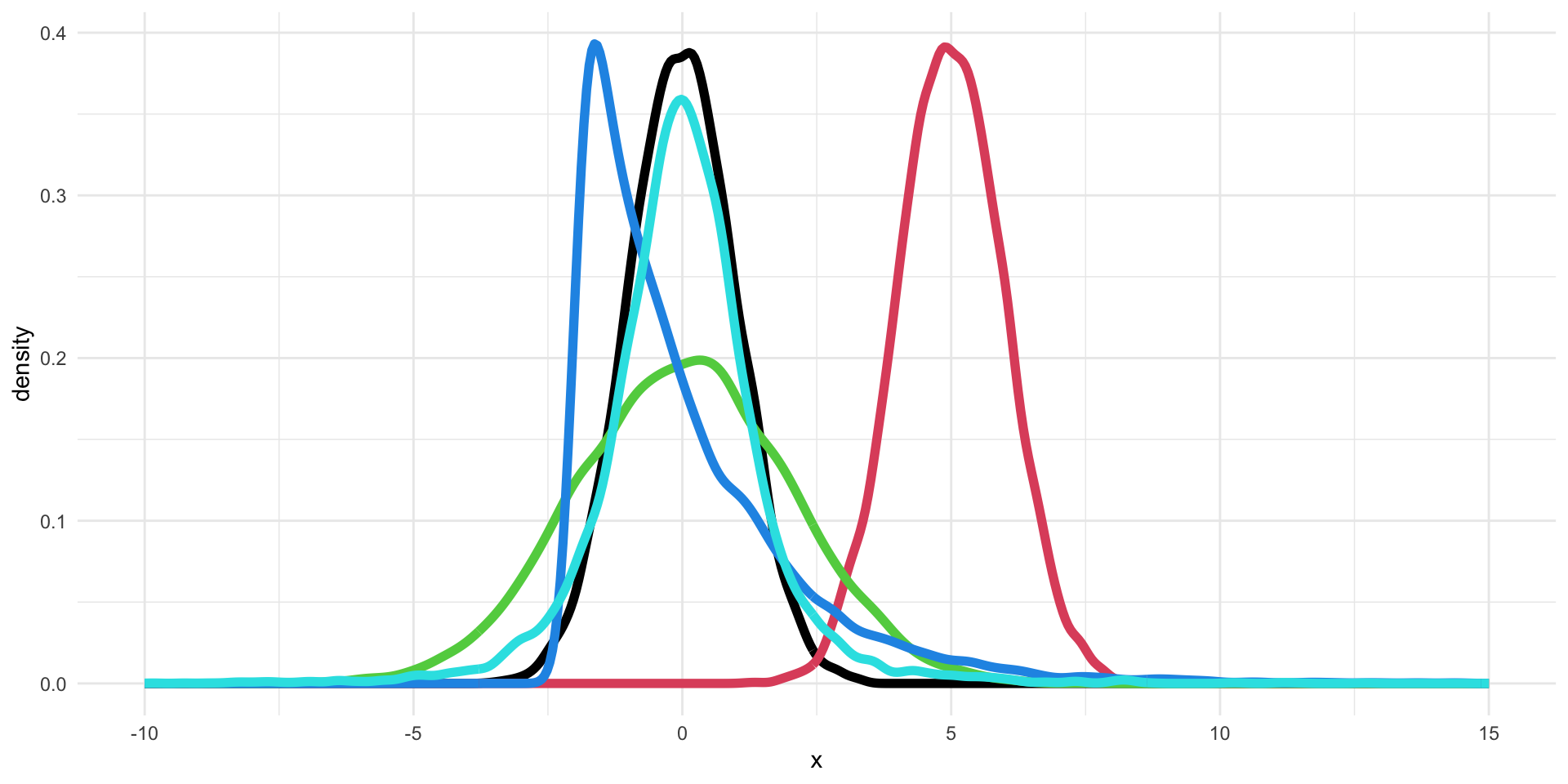
Can we describe the differences between these five distributions using numerical summaries?
- Location: what is the “most common” value of the distribution?
- Scale: how concentrated are the values aroung the average?
- Shape: what is the shape of the distribution?
Location: Mean and Median
The first numerical summary relates to the location of the distribution.
The simplest summary is the (arithmetic) mean.
Given a list of \(n\) numbers, \(\{x_1, \ldots, x_n\}\)
\[ \bar{x} = \frac{\sum_{i=1}^n x_i}{n}. \]
A robust alternative is the median, which is simply the central observation. One can simply compute the median by ordering the observations and selecting the one that falls in the middle.
The median is a robust summary, in the sense that it is less influence by extreme values.
Example: Mean vs Median
Example: Location of the five distributions

The means of the five distributions are: 0, 5, 0, 0, 0.
Scale: Standard Deviation and Variance
The standard deviation (SD) measures the spread or scale of a distribution.
It is defined as
\[ s_x = \sqrt{\frac{\sum_{i=1}^n (x_i - \bar{x})^2}{n -1}}. \]
The variance is the square of the standard deviation.
If the data are approximately normally distributed, roughly 68% of the observations are within one SD of the mean and 95% within two SD.
Scale: Robust Alternatives
Similarly to the median for the mean, there are robust summaries to describe the scale of the distribution.
The inter-quartile range (IQR) is the difference between the upper- and lower-quartile, i.e., the observation that has \(75\%\) of the data below it and the observation that has \(25\%\) of the observations below it, respectively.
The median absolute deviation (MAD) is the median of the absolute deviations from the median:
\[ MAD_x = \text{median}( | x_i - M_x |) \] where \(M_x\) is the median of \(\{x_1, \ldots, x_n\}\).
Quantiles
The median, upper-quartile, and lower-quartile are examples of quantiles.
More formally, the \(f\) quantile or \(f\times 100\)th percentile of a distribution is the smallest number \(q\) such that at least \(f \times 100\)% of the observations are less than or equal to \(q\).
In other words, \(f\times 100\)% of the area under the histogram is to the left of the \(f\) quantile.
Quartiles
| First/lower quartile | 0.25 quantile |
| Second quartile/median | 0.50 quantile |
| Third/upper quartile | 0.75 quantile |
The Median as a Quantile
The median corresponds to the special case \(f=0.5\).
If the number of observations \(n\) is odd, i.e., \(n=2m+1\), there will be an observation that corresponds to the median.
If the number of observations \(n\) is even, i.e., \(n=2m\), we need to average the two central observations.
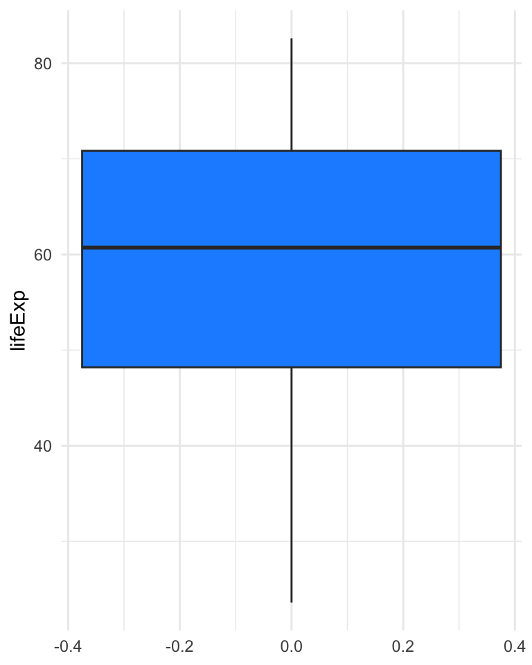
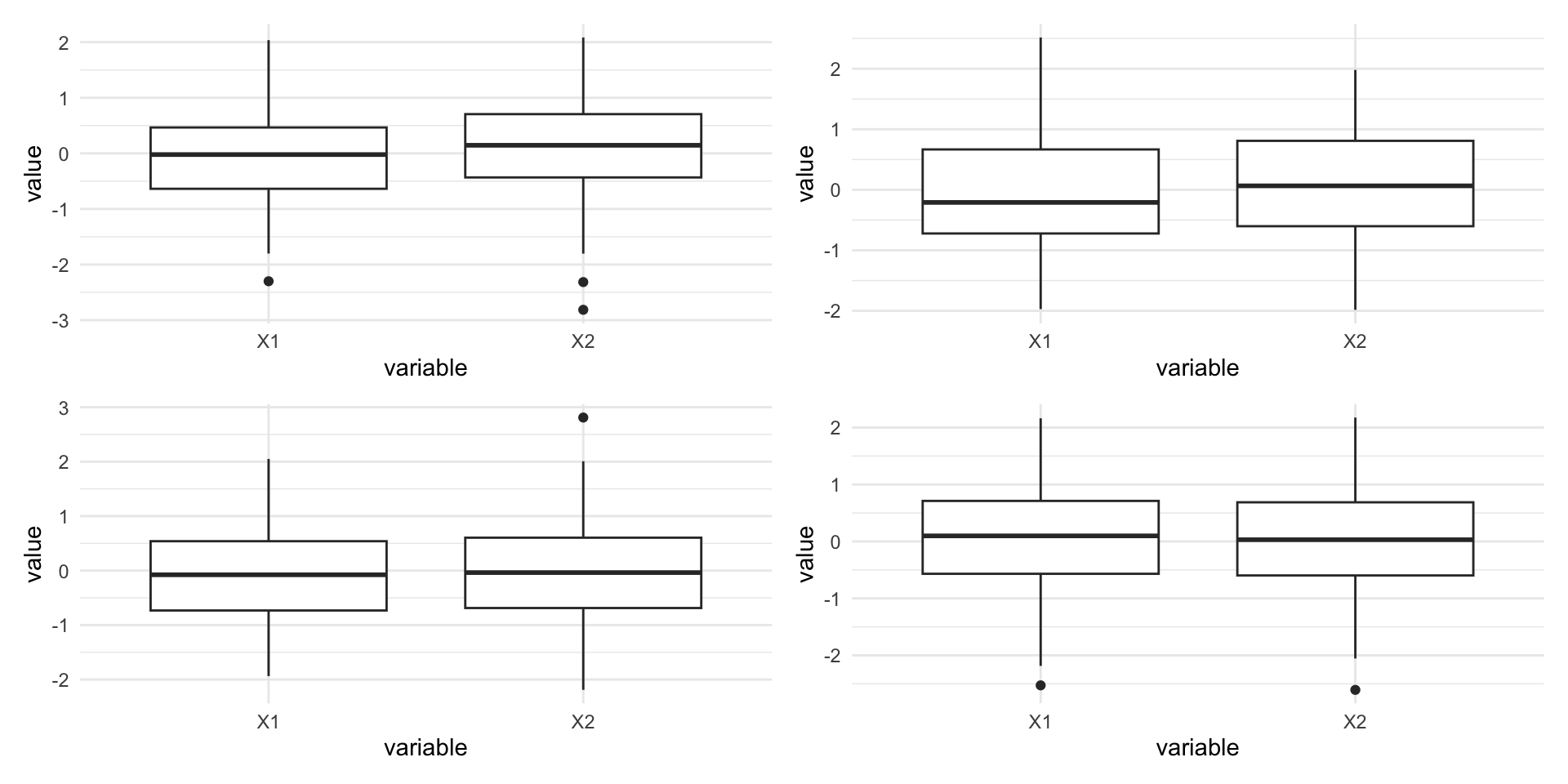
Boxplot
The boxplot, also called box-and-whisker plot was first introduced by Tukey in 1977 as a graphical summary of a variable’s distribution.
It is a graphical representation of the median, upper and lower quartile, and the range (possibly, with outliers).
Boxplot
Boxplot
- The bold line represents the median.
- The upper and lower sides of the box represent the lower and upper quartiles, respectively.
- The central box represents the IQR.
- The whiskers represent the range of the variable, but any point more than 1.5 IQR above the upper quartile (or below the lower quartile) are plotted individually as outliers.
- Comparing the distances between the quartiles and the median gives indication of the symmetry of the distribution.
Boxplots of the five distributions
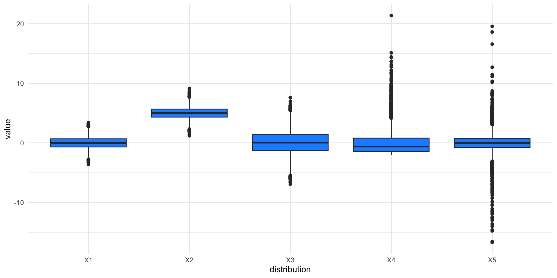
Pros and Cons of Boxplots
Boxplots are a great graphical tool to summarize distributions, especially when they are approximately normally distributed.
Even in the presence of strong asymmetry, the boxplot still captures the shape of the distribution.
One of the advantages of the boxplot is its effectiveness at identifying outlying observations.
However, the boxplot hides multimodality in the data.
Pros and Cons of Boxplots

Scale of the five distributions

The standard deviations of the five distributions are: 1, 1, 2, 2, 2.
Shape of the five distributions
Even though the green, blue, and cyan distributions have the same mean and variance, they are clearly different.
How can we capture these differences?
There are numerical summaries called skewness and kurtosis, but the most effective way is to look at graphical summaries (boxplots and histograms).
The skewness of the five distributions are: 0, 0, 0, 2, 0.
The kurtosis of the five distributions are: 3, 3, 3, 10, 18.
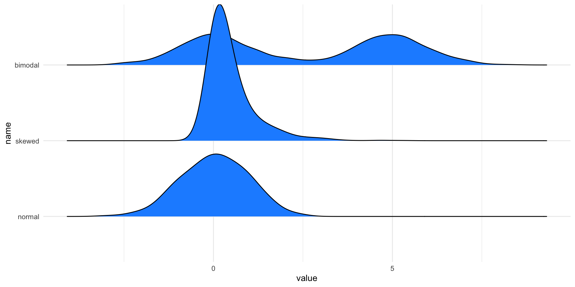
Alternatives to boxplots
Boxplots can be used to visualize multiple distributions at once.
If we want to do the same using kernel density, we can use violin plots or ridgeline plots.
Violin plots

Ridgeline plots
Visualizing two variables
Graphical Summaries of Two Variables
Boxplots, histograms, and density plots all summarize the univariate distribution of a single variable. But what if we want to capture the relation between variables?
The most used graphical representation of the relation between two variables is not a summary. We can simply plot all the observations for the two variables in a scatterplot.
When there are too many observations, summaries based on 2D-density estimation can be used.
Scatterplots

Considerations for scatterplots
Even for this simple element, there are important considerations to make when presenting results.
In fact, “stretching” one or the other axis may lead to emphasizing one aspect over others.
This is particularly important in the case where the measurements of the two axes are similar and should be treated as such.
Tip
Use the coord_equal() function in ggplot2 to ensure equal coordinates.
Coordinate systems and axes
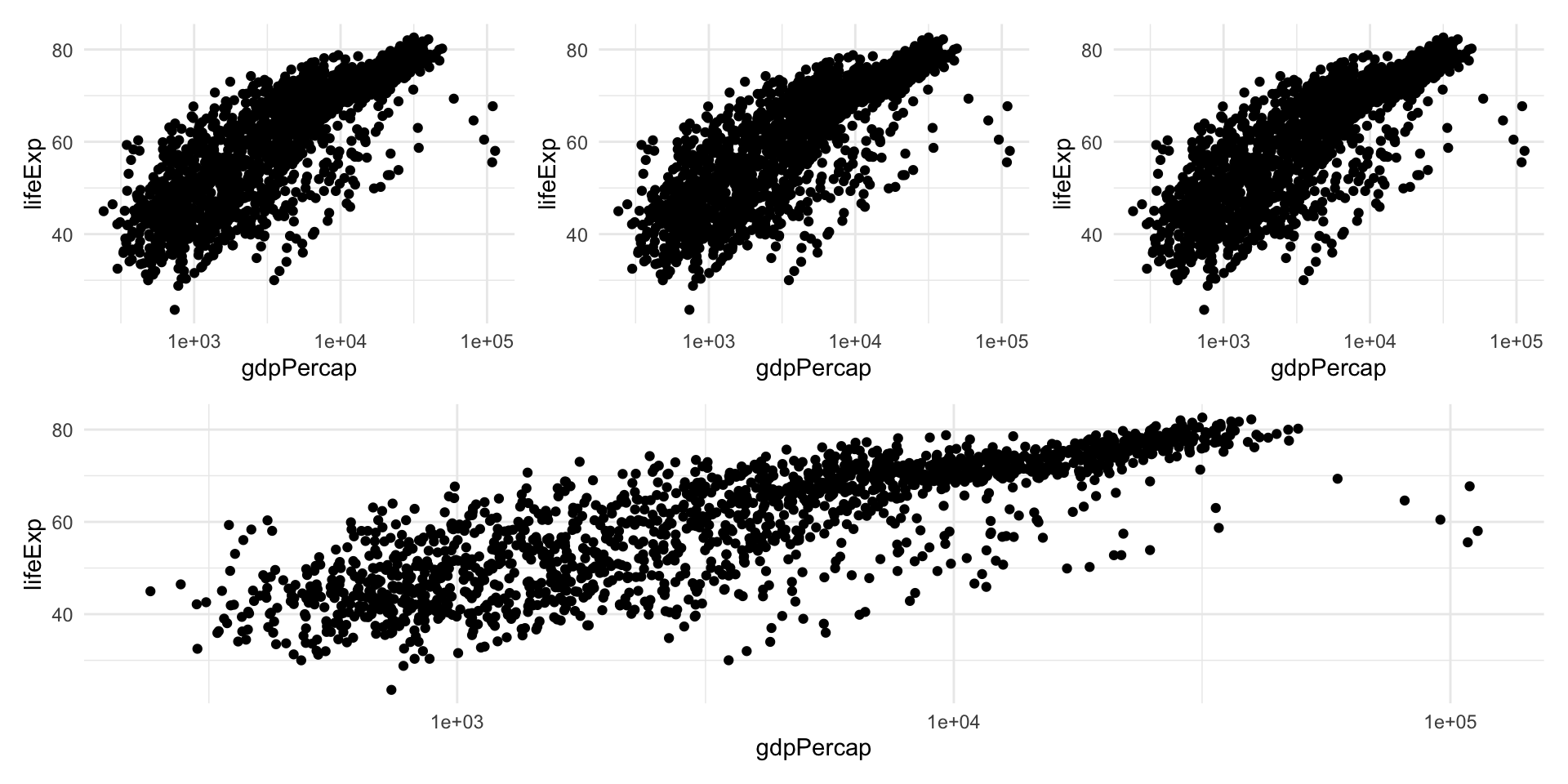
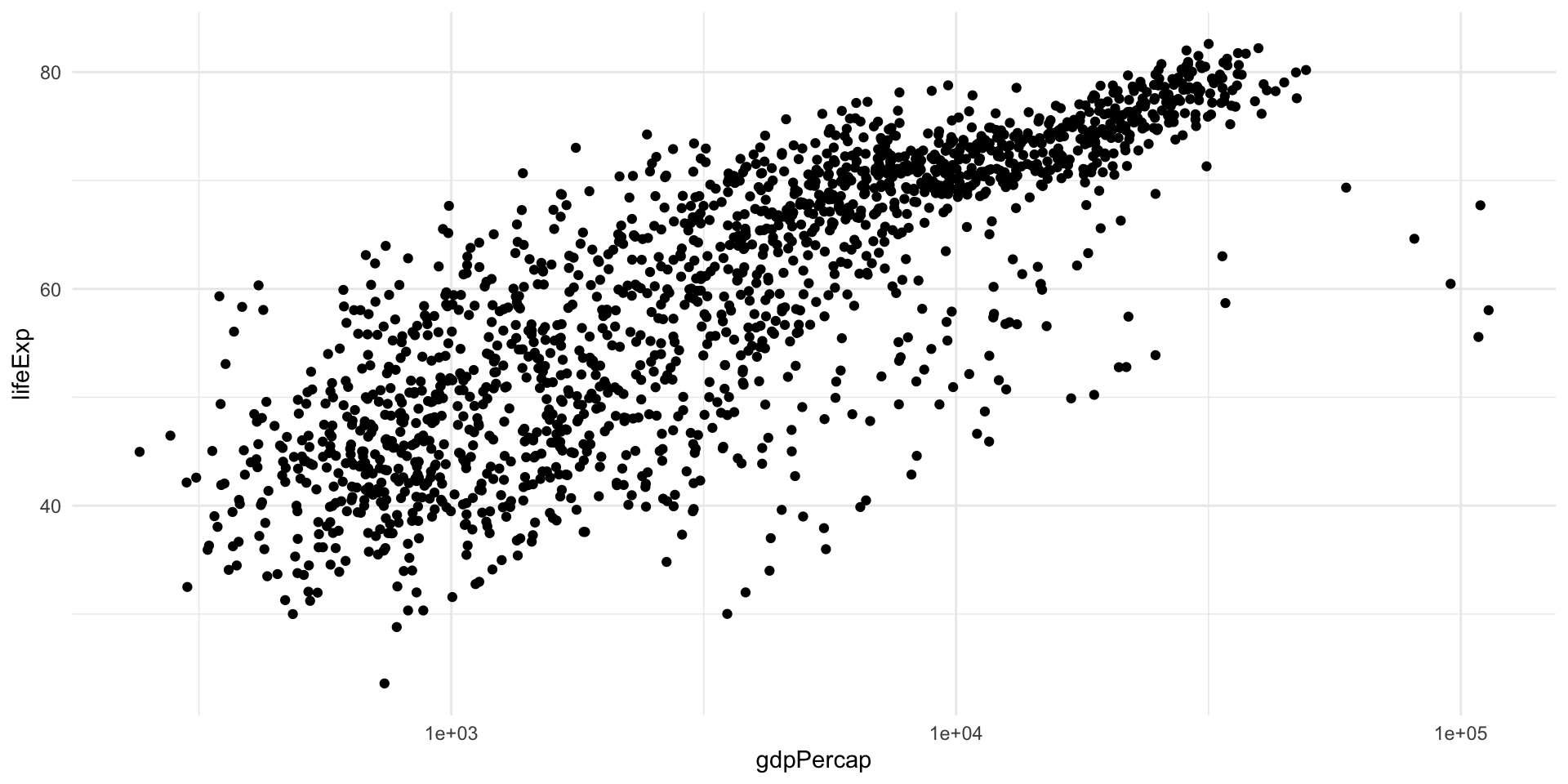
Data transformation
You may have noticed that I used the logarithm of GDP per capita in the previous plot.
This is because in the linear scale this variable has a skewed distribution most points are “squished” to the left, making the general trend difficult to see.
Log transformation, like many data transformations, can be useful, but sometimes can create distorsions; hence, it is always good to try different scales for your data in the exploratory phase.
Example
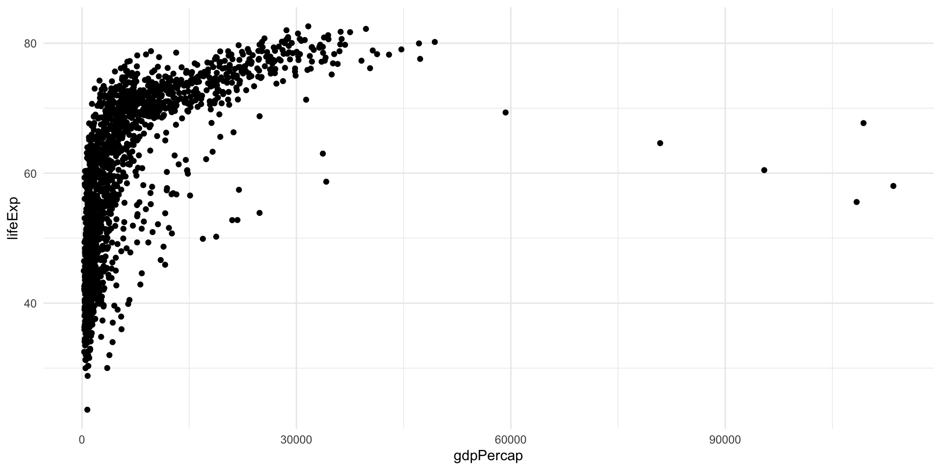
Example
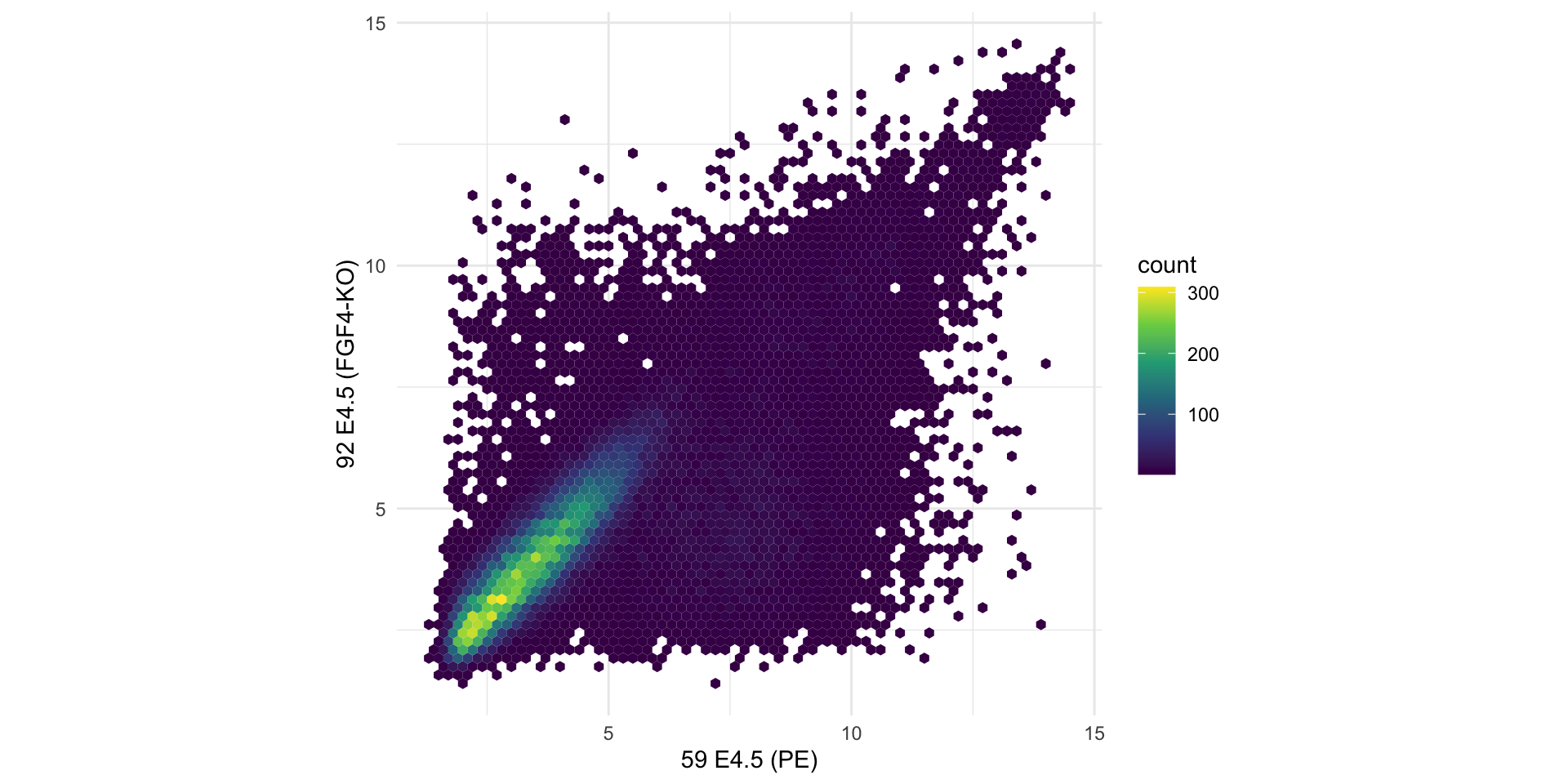
Avoid overplotting
When there are too many data points, plotting every point is redundant and may cause loss of information.
In such cases, it is better to display the two-dimensional density of the points, either with contours or with hexagonal binning.
Example
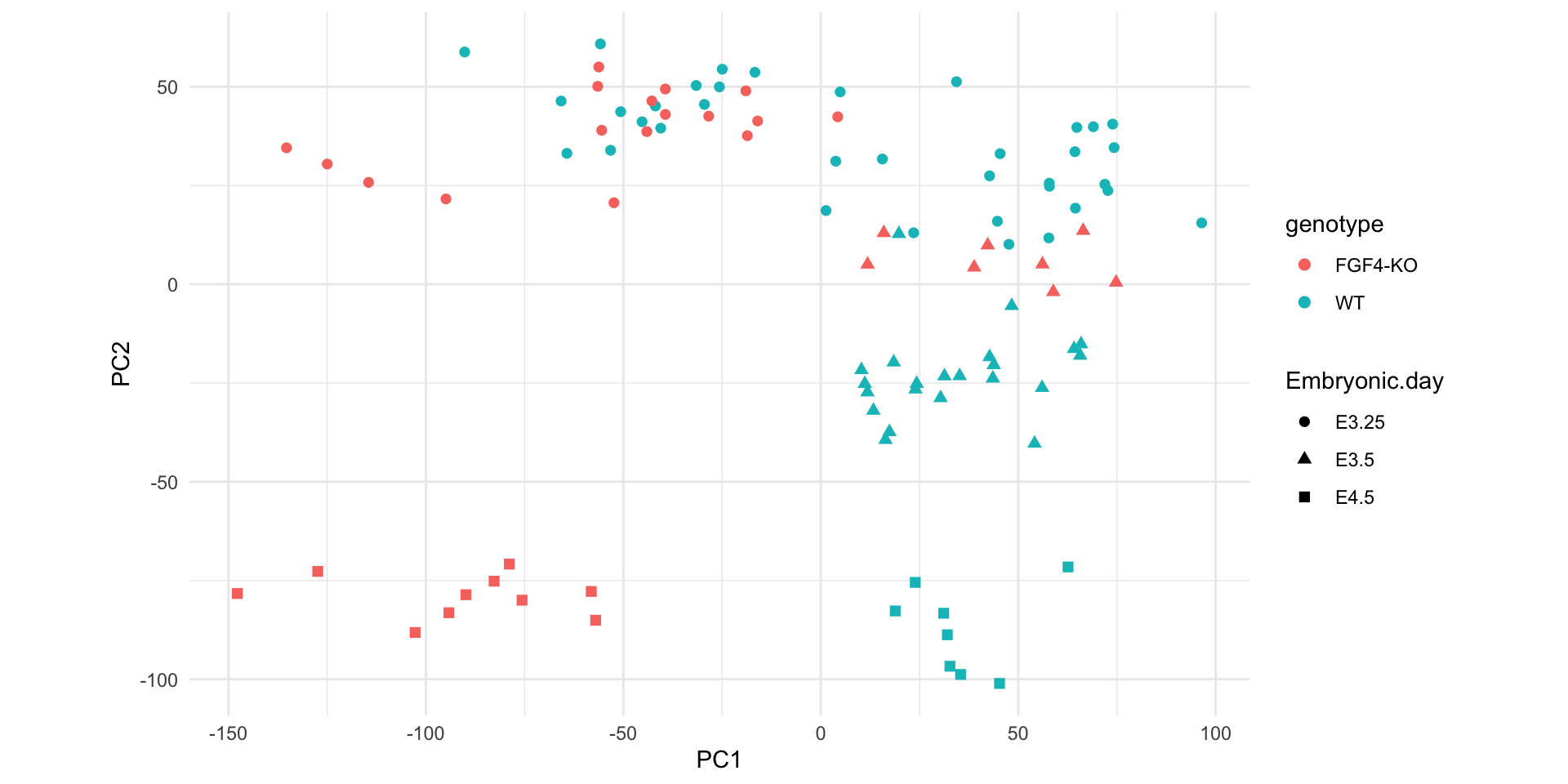
Let’s have a look at an example dataset, which contains the expression of 45101 genes in two embryos.
Here, we are plotting tens of thousands of points, many of which are on top of each other.
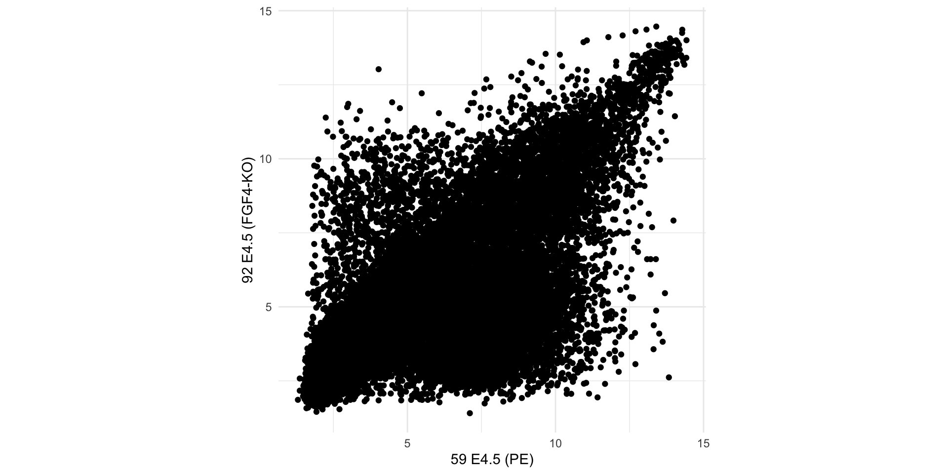
Example
We can estimate a 2D density and plot the density function instead of (or in addition to) the points.
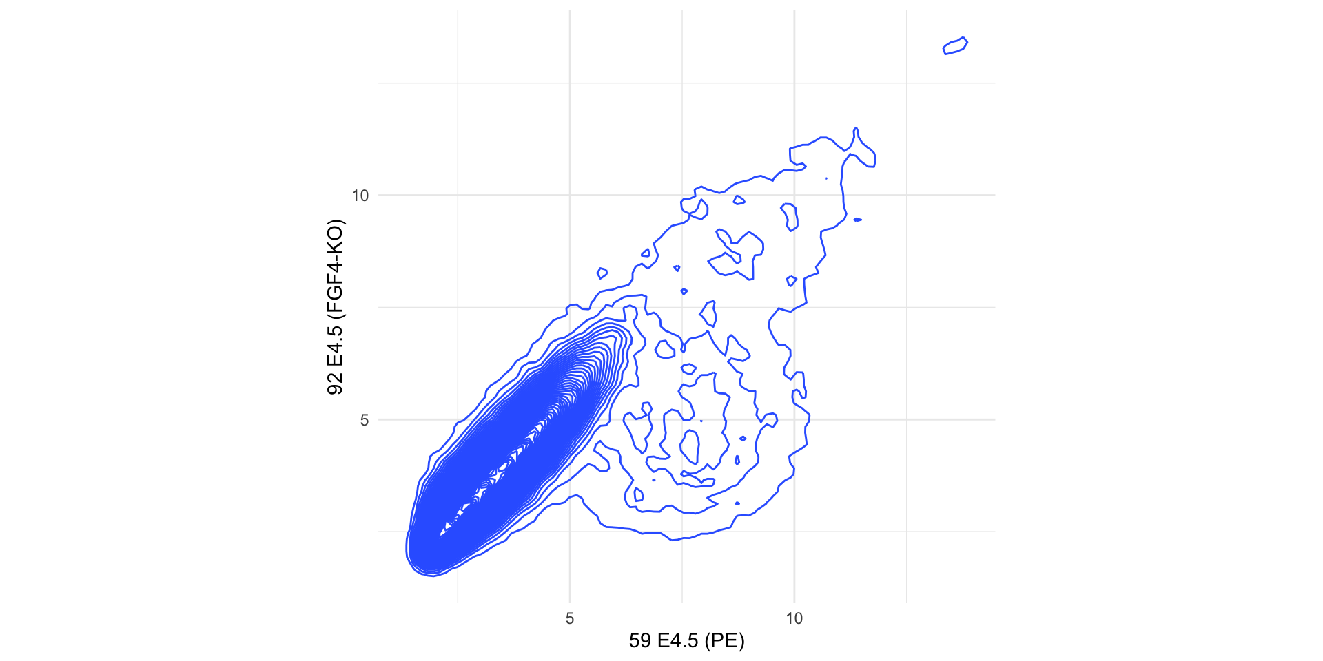
Example
In this case a better alternative is to use hexagonal binning of points to represent their density.
Numerical Summaries of Two Variables
The variance and standard deviation are summaries of the spread of the distribution of one variable.
We can compute them for multiple variables, but they will not tell us anything about the relationship between two or more variables.
The covariance can be used to assess the relation between two variables, say \(x\) and \(y\).
\[ Cov(x, y) = \frac{1}{n} \sum_{i=1}^n (x_i - \bar{x}) (y_i - \bar{y}). \]
Correlation Coefficient
The problem with the covariance is that it depends on the scale of the two variables. It is often more useful to have an absolute indication of the strength of the relation, such as an index between -1 and 1.
Such an index is the correlation coefficient.
It is a measure of the linear association between two variables.
\[ r = Cor(x, y) = \frac{1}{n} \sum_{i=1}^n \left( \frac{x_i - \bar{x}}{s_x} \right) \left( \frac{y_i - \bar{y}}{s_y} \right) \]
This is also called Pearson correlation.
Spearman’s correlation coefficient is a robust measure of correlation, where ranks are used in place of the values of \(x\) and \(y\).
Example of Correlated and Uncorrelated Data
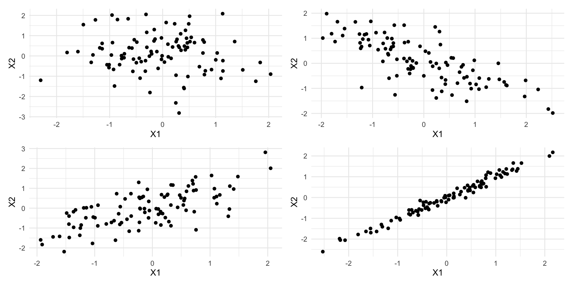
These patterns are not captured by univariate techniques
Visualizing more than two variables
Faceting
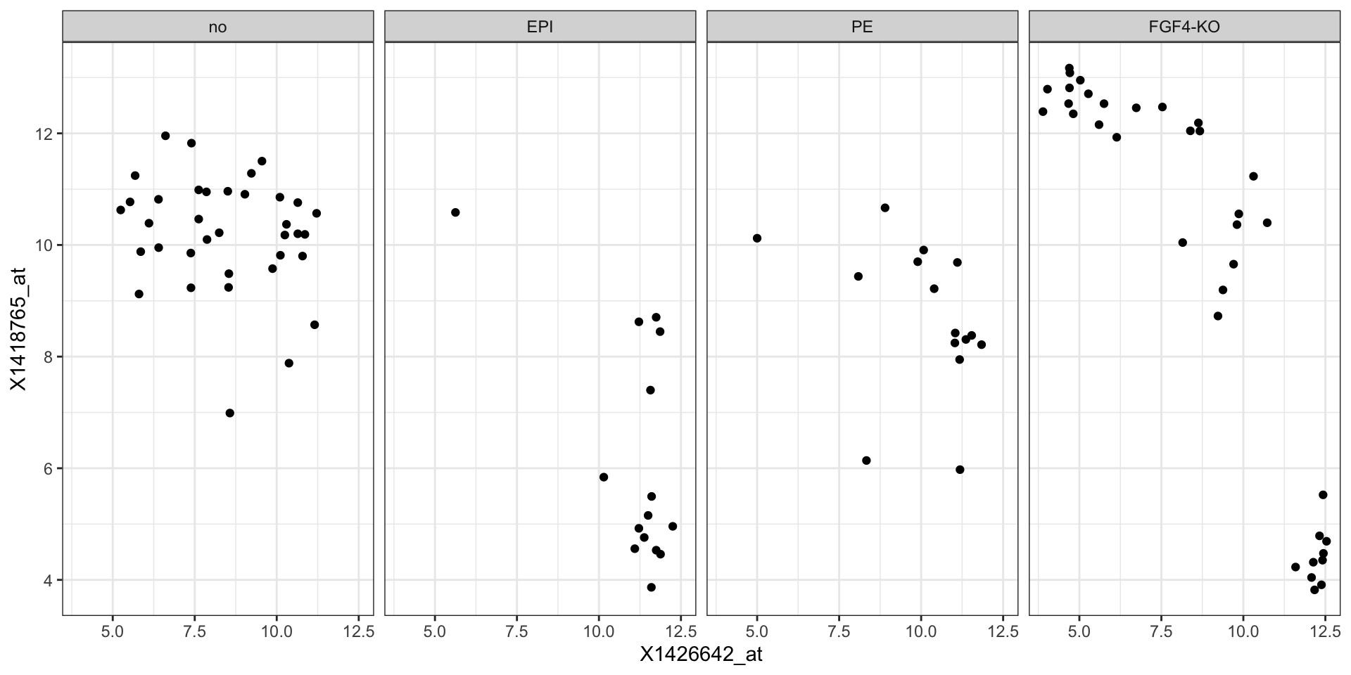
The embryo gene expression example dataset is much more complex than what we have been looked at earlier.
It contains 45101 genes measured in 101 samples.
In some cases, it may be useful to use faceting to represent a third dimension, e.g., this plot shows the relation between two genes across samples, stratified by genotype.
Faceting
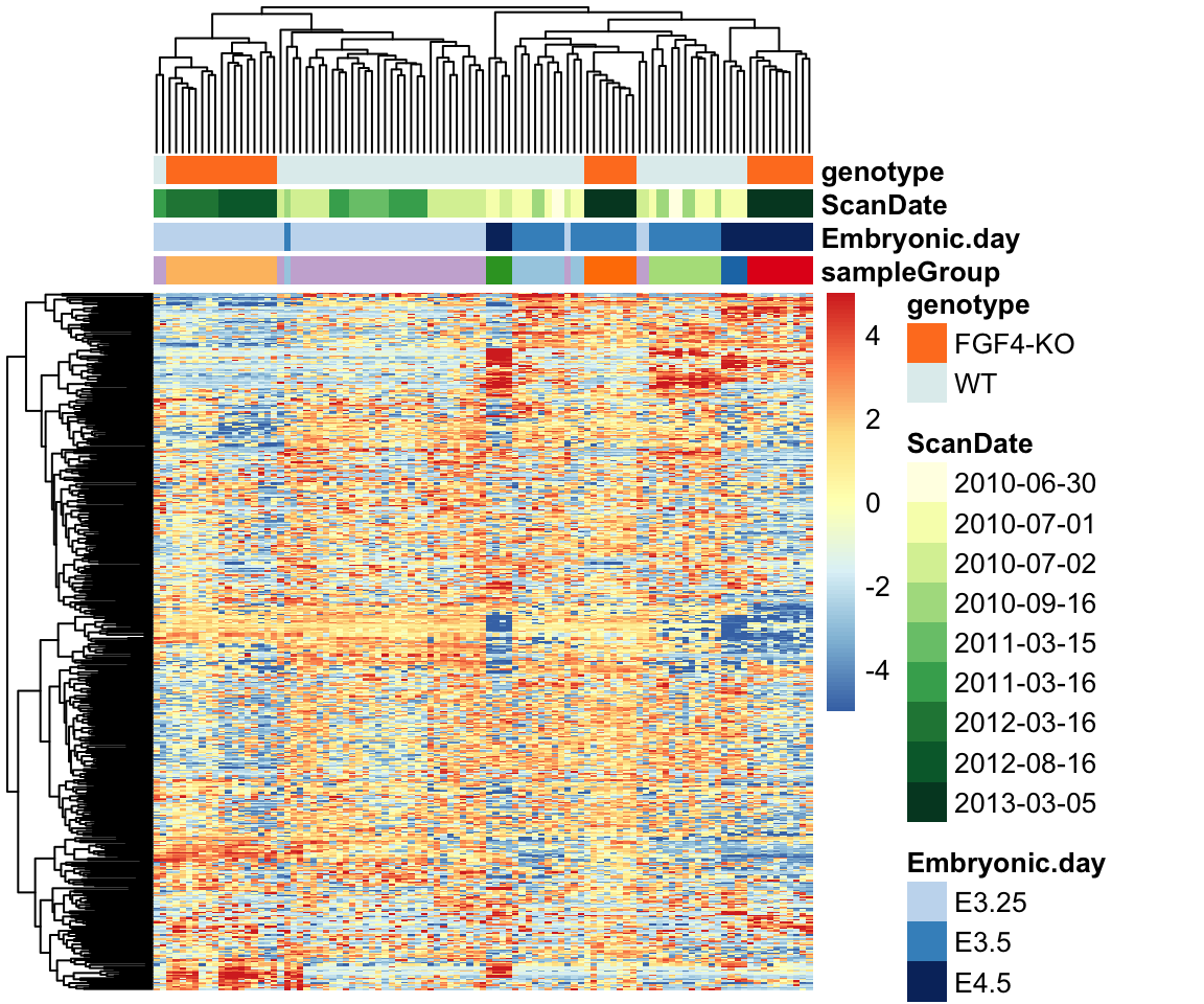
Heatmaps
Heatmaps can be used to visualize high-dimensional data.
Dimensionality reduction
A smart alternative for high-dimensional data is to project the data points onto a lower-dimensional embedding, such as the space of the first principal components.